Mining Hope:
Preserving and Exploring Twitter Data for Digital Visual Studies
Methods and Findings
Exploratory and descriptive statistics are just that—exploratory and descriptive. When we explore data, our goal is not to confirm or falsify, but to simply look for interesting patterns or data that raise questions or inspire further inquiry. When we describe data, we are not strictly predicting or testing, but merely doing our best to provide a careful portrayal of some aspect of our data: changes over time (time series), categorical descriptions (genres, topics, terms), quantitative totals (sums, averages, percentages, frequencies, etc.), maps/locations (chloropleths, coordinates), and many others. It would be too strong a claim to suggest that our descriptions and explorations in this section are representative of Twitter users’ opinions about Obama Hope, and it would also be a mistake to suggest our findings represent public opinion more generally. Our goal is to explore the reactions, comments, and other responses to Obama Hope—to get a sense of how those reactions, comments, and responses may have changed over Obama’s administration.
When we tested possible search queries through Twitter’s advanced search functionality, the most obvious search terms like “Obama Hope” returned lots of data, but they also had substantial numbers of tweets that had nothing to do with Fairey’s design. For example, many tweets said things like: “We sure hope Obama can fix healthcare” and other commentary not referring to Obama Hope. We thus tested many other phrases and word combinations until we settled on the following: "'fairey AND hope' OR 'obama AND hope AND poster.'" This allowed us to harvest IDs for the 24,945 tweets in our dataset, which we then uploaded to the DocNow! archive. This edited collection includes the “Hope Archive: Datasets and Artifacts for Future Research,” and this archival section of Doing Digital Visual Studies provides full access to the tweets used in this chapter, the full Obamicon dataset, and the new Trumpicon dataset. The “Hope Archive” also includes instructions for accessing the data, and resources for beginning to explore and describe those datasets for readers’ own research projects.
In the descriptions that follow, we show, for each year in our dataset, (1) the most favorited tweet, (2) the most retweeted tweet, (3) and the top 10 most frequently occurring words in the tweets themselves. For 1 and 2, we simply used the metadata from Twitter—returned by MassMine—when we rehydrated the tweet IDs (Van Horn and Beveridge). For every tweet in the dataset, Twitter provides numeric totals on the number of favorites and retweets each tweet received, and we have selected and displayed below the tweets that have received the highest number of favorites and the highest number of retweets for each year. When the most favorited and most retweeted tweet, for each year, were the same tweet, we selected the second most retweeted tweet to remove redundancies. Furthermore, when there were ties within the categories of most favorited and most retweeted, we selected the tweet produced by the user with the highest number of followers.
For determining word frequencies, we used the tf-idf method. Since tweets are tiny documents, and tf-idf favors terms that appear frequently in one document, but less (or, ideally, never) in other documents, we ran into the problem with odd phrases producing nonsensical terms with very high tf-idf scores. Having a list of top-10 terms that don’t yield meaningful insights effectively renders the method useless. To combat this problem we treated each year of tweets as a separate corpus. Within each corpus, we concatenated all tweets into a single string of text (i.e., a single "document"). This gave us 108 documents, or 12 documents per year1), thus producing a document for each month of tweets. The result is a single figure for each year that shows the top-10 terms for each year. The text in the documents was reduced to the most meaningful words by removing filenames, stop words (words like: the, and, it, at), by removing extra white space (so that each word is separated by one space in each document), by transforming hyphenated words into two separate words, and by removing the words used in our search queries. These are standard “data janitorial” techniques (Beveridge). For further information on these and other similar methods, see Text Mining with R. This book provides a great introduction to text mining, in particular, and it contains many code examples—including code examples that reproduce the word frequency graphs used in this section.
This approach to “reading” the text contained within a year’s worth of tweets truly provides a meaningful definition of the term macroscopic, as things like grammar, syntax, and punctuation are all meaningless to this type of bag-of-words reading. In fact, the computer does not “read” at all. It treats unique strings of characters (words) as things to count and categorize. So when certain words show up in the top-10 lists of our word frequency graphs, it’s not because the computer knows the definitions of those words when choosing them for the graph. Rather, they show up in the graphs only because our method of counting determined that these were the most frequent strings of characters (words). The information in this graph only becomes meaningful when contextualized and interpreted by a human reader.
Additionally, we did preserve the @ and # characters in our dataset, as standard punctuation removal techniques usually scrub these characters from text data. However, hashtags, which by design (or in practice) tend to arise in many tweets, are punished by the tf-idf method and so don't appear due to their high frequency, and no @usernames occurred frequently enough in any given year to be displayed as top-10 terms in our figures. Because of this, we double checked raw word-counts for yearly word frequencies to ensure that important #hashtags were not ingored by the tf-idf method. The tweets in this dataset were not particularly fueled by hashtagging, hence why they don't rank high enough.
Below you will find a table showing the results of our data mining activities, and a set of word frequency graphs. We have a word frequency graph for each year in our dataset, and we have a 2 rows for each year in our dataset in the table. For each row in the table we provide the text from the tweet, and a link to the original tweet as it still appears on Twitter.
Yearly Descriptions
| Year | Tweet Text | Type | Source2 |
|---|---|---|---|
| 2008 | Shepard Fairey -O Hope poster designer creates poster for protests http://twurl.nl/j8qeai\ndemand fist full of equality cause love unites | Favorited | view |
| 2008 | N/A | Retweeted | N/A |
| 2009 | Obama 'Hope' Poster Creator Not Credible: AP http://su.pr/1Qz7eI | Favorited | view |
| 2009 | New rules for 2010: 1) We're outlawing rendering anything like a Ché Guevara poster or Obama "Hope" poster. | Retweeted | view |
| 2010 | Art & Crime: With a Date Set for His "Hope" Trial, Shepard Fairey Airs a Novel Defense Online http://bit.ly/b974fz | Favorited | view |
| 2010 | Shepard Fairey, who created the Obama "Hope" poster: "I had a lot of hope for Obama, but it's not panning out." (Snap.) http://bit.ly/a5Y5qA | Retweeted | view |
| 2011 | Shepard Fairey's new "Occupy Hope" poster, in which Obama's face is replaced by a Guy Fawkes mask http://t.co/G0Z158pA | Favorited | view |
| 2011 | The artist behind our #POY2011 cover is Shepard Fairey, who created the iconic "Hope" poster of Obama in 2008 | http://t.co/O4QbVY5T | Retweeted | view |
| 2012 | So awesome meeting Shepard Fairey (@OBEYGIANT), creator of the 2008 Obama HOPE poster. http://t.co/y9weuveb | Favorited | view |
| 2012 | The artist behind Obama 'Hope' poster sentenced to 2 years probation in copyright dispute. http://t.co/BcRtb7t2 | Retweeted | view |
| 2013 | Shepard Fairey aka @OBEYGIANT, the guy behind @BarackObama's 'Hope' poster, wants more arts at school: view | ||
| 2013 | "You have to accept that visuals are a form of propaganda." @OBEYGIANT on his Obama: Hope poster. #cannes2013 | Retweeted | view |
| 2014 | My finished piece for @LTDartgallery's PAX art show! I hope you like obscure Bioshock and Shepard Fairey references http://t.co/WXtdoUeP3m | Favorited | view |
| 2014 | How the font from the Obama "hope" poster defines our era: http://t.co/bWDgW7gHHB http://t.co/or53KyP3IH | Retweeted | view |
| 2015 | Report: Artist Who Drew Iconic Obama ‘Hope’ Poster Has Lost Hope In Him http://t.co/HbfhMHda0J #WhatDoYouThink? http://t.co/p6nNGtBurU | Favorited | view |
| 2015 | Detroit police issue arrest warrant for artist behind Obama 'Hope' poster http://t.co/8JpSCy6vdX http://t.co/am0OmPR0v5 | Retweeted | view |
| 2016 | Wow! Thank u Shepard Fairey for this wonderful work of art. I loved your 'Obama Hope' poster. Honored by this. https://t.co/M3Qhk5b9hy | Favorited | view |
| 2016 | Obama ‘Hope’ Poster Artist Calls President a Failure https://t.co/ewmSzgFWzn @DRUDGE #tcot #trump Please RT! https://t.co/vhGOna4eB4 | Retweeted | view |
Figure 1. Table with most retweeted and most favorited tweets from 2008 to 2016 (inclusive). Click on "view" to see original tweet as displayed by Twitter.
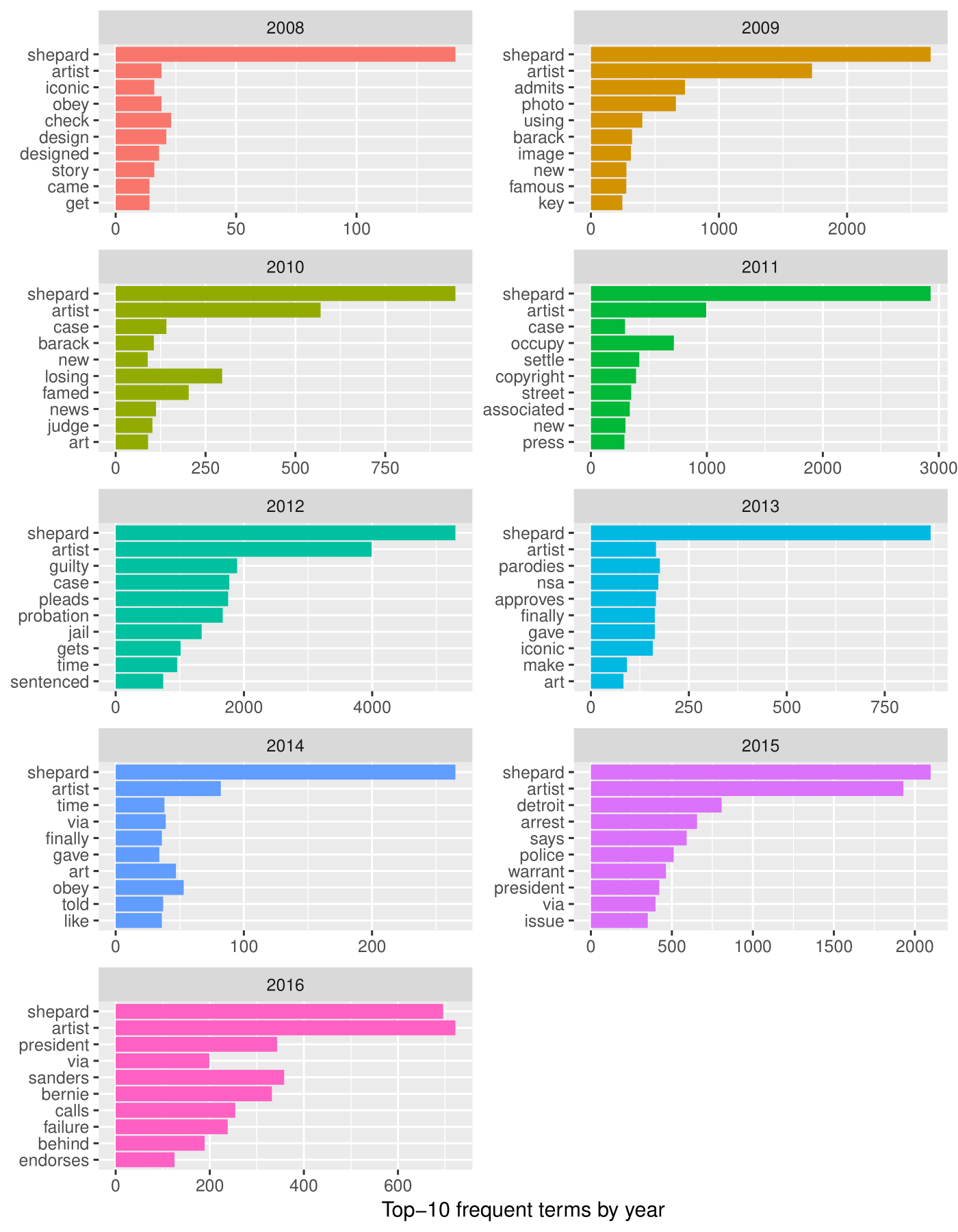
Figure 2. Top-10 most frequent words from 2008 to 2016 (inclusive), using tf-idf method.
Insights Yielded
In many ways, the Twitter data above demonstrates that while Obama Hope clearly drew the attention of Twitter followers, it was Shepard Fairey himself who catalyzed many reactions, comments, and responses. In Still Life with Rhetoric, Gries makes Obama Hope the central character in her four part case study, revealing the ways that Obama Hope, as an important actor in its own right, catalyzed a plethora of rhetorical consequences around the world. While surely Obama Hope did attract global attention and inspired thousands of remixes that became part of important collective activities around the world, the Twitter data above suggests that as much as Obama Hope gained fame from its circulation, so too did Shepard Fairey. Whether retweeting links to his appearance on the Colbert Report or liking the fact that someone met him in person or liking tweets about his new designs, Twitter followers were captivated with Shepard Fairey. Before producing and distributing Obama Hope, Fairey was already famous for his Obey campaign, as evident in the most favorited tweet in 2009 in which he was referred to as “Shepard Fairey of Obey Giant.” But this Twitter data suggests, that once Obama Hope began to circulate and gain mass attention, Fairey began to attract widespread social media attention for a variety of actions. The word frequency graphs, read chronologically, actually reveal how such attention shifted with new developments in Fairey’s (and Obama Hope’s) life. In 2008, for instance, we see Fairey gaining attention for his Obama Hope design, which at that point was already being called iconic. By 2009, the copyright scandal with AP over Fairey’s Obama Hope design entered into the spotlight, a scandal that occupied Twitter attention through 2012. In 2010, for instance, the most favorite tweet pertained to Fairey’s “‘Hope’ Trial” and his “novel defense” while in 2012, the most retweeted tweet pertained to Fairey’s 2 year probation sentence. As street artists, people are naturally interested in the way Fairey becomes involved in, as one tweet put it, “Art and Crime,” so it will come as no surprise that it was not only his AP trouble that gained attention but also his 2015 arrest in Detroit. Interestingly, by that time, Fairey once mainly associated with Obey Giant was now commonly referred to as “the guy” or artist behind the Obama Hope poster.
Fairey, of course, captured Twitter attention for other reasons as well. To no surprise, perhaps, when he released new designs, such as his “Occupy Hope” design with a Guy Fawkes mask replacing Obama in the portrait, he was tweeted about. For instance, in 2016, the most favorited tweet was Michael Moore’s thank you tweet to Fairey for designing a poster promoting Moore’s documentary Where to Invade Next. But more surprising, the Twitter data above discloses how many Twitter followers became interested in Fairey’s own political ideas. In one sense, as evident in the most retweeted tweet from 2010, people were interested in Fairey’s ideas about Obama. As an artist who is often credited for doing much to win Obama the oval office, it was intriguing to many, obviously, that Fairey began to speak out regarding his disappointment that his hope in Obama was “not panning out.” In 2016, for instance, the most retweeted tweet was about Fairey calling Obama a “failure”—a word that made it to the top-ten term list that year according to the word frequency graph from that year. But the Twitter data also suggests that people were interested in Fairey’s opinions about political art as a means of propaganda. In 2013, for instance, the most retweeted tweet quoted Fairey saying “You have to accept that visuals are a form of propaganda.” Such revelation, of course, was not new to many. Four years earlier, in 2009, the most retweeted tweet was “New rules for 2010: 1.) We’re outlawing rendering anything like a Ché Guevara poster or Obama ‘Hope’ poster.” As Gries’ rhetorical biography of Obama Hope also reveals, many resented Obama Hope and Fairey for infusing American politics with such popular and powerful political propaganda. It is no wonder then that even as Fairey supported Bernie in 2016, he decided not to generate a poster for that election, choosing instead to focus his attention on other political matters such as the protest of Trump, for which he designed the now iconic “We the People” series.
While such findings may not be revelatory in terms of Fairey’s own biography, this Twitter data does point to an unrecognized inquiry about Obama Hope that Gries’ and other’s work with Obama Hope has yet to yield—a question that we think is important for scholars interested in visual studies to more deeply consider. What is the complex impact that a single piece of art has on the artist him/her/theirself? While Gries did discuss in Still Life with Rhetoric, of course, the ways in which Fairey was caught up in the copyright scandal as well as ensuing accusations of propaganda, this Twitter data discloses that Obama Hope’s impact on Fairey himself is likely to be more complex than we have yet to discover, especially as Obama Hope’s consequentiality on Fairey’s life only continues to unfold. What more about Obama Hope, then, might we learn if we made concerted efforts to study how it has impacted Fairey’s own life in both positive and negative ways?
In addition, the Twitter data above indicates that concentrated social media studies of visual artifacts have potential to identify previously undiscussed rhetorical consequences that those artifacts have helped to catalyze. For instance, while we did not mention this above, in 2014, the most retweeted tweet shared a link to a Slate article about how the Gothom font used in the Fairey’s Obama Hope design has come to define our contemporary era. In the article, Obama Hope functions as a representative anecdote to illustrate just how ubiquitous the Gothom font has been. In a related article on the same topic, the author goes so far to post a picture of Obama Hope and claim that “One of the most iconic and widely received messages ever laid out in Gotham consisted of a single word: “HOPE” (Hawley). The author also goes on to discuss how the Obama Hope design has made a “lasting impression” on American politics, quoting one graphic designer who claims “I think the whole Obama design program changed the look of politics” (qtd. in Hawley). While Gries has acknowledged the importance of Obama Hope in American politics in other ways, Gries missed this important rhetorical contribution. When we adopt exploratory and descriptive methods in our digital visual studies research then, we create opportunities for not only new research questions and paths to open up but also new evidence to emerge for our own rhetorical research agendas.
1. Technically, there were only 107 documents, as one month had zero tweets and so it doesn't appear in the dataset.↩
2. If the links below are broken, then the tweet you are trying to view has been deleted by its author.↩