Designerly Intentions
A careful analysis of the design and development choices in Turnitin's Originality Report reinforces “the beliefs and practices of the everyday lifeworld, and culturally biased knowledge sedimented in technical disciplines shaped by a history of technical choices” (Feenberg & Feng, 2008, p. 106). The Originality Report has been similarly shaped by an emphasis on appropriate (that is, non-plagiarized) material as that which is wholly original, an attitude that Lunsford (1996) has stated leads to hypercitation, endless listing of sources, and other artifacts of our desire to own ideas as property (p. 270). As stated earlier, this underlying assumption does not accurately reflect twenty-first century composing processes and in fact collapses a host of issues—shared authorship, remix and reuse, cultural understandings of authorship, etc.,—unsatisfyingly into the simplistic term plagiarism.
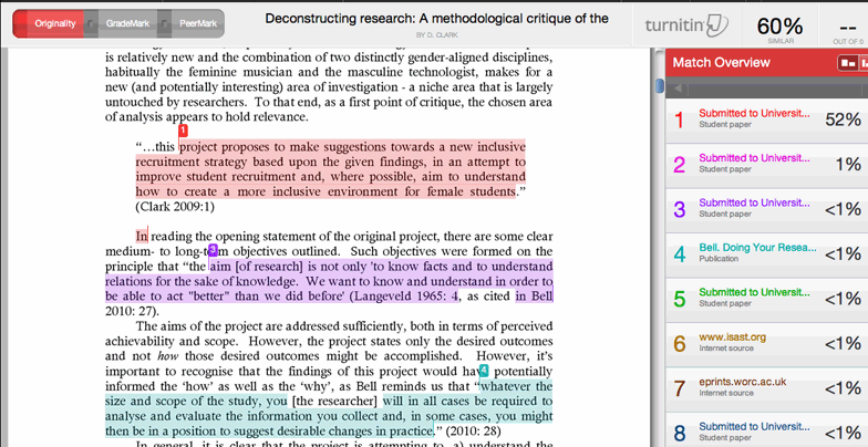
The originality report is a design artifact that illustrates how even something as simple as color choice can, whether consciously or subconsciously, be the result of the designer being influenced by dominant cultural understandings. In the case of the Turnitin originality report, papers are sorted for originality based on a percentage of material that matches work found in Turnitin’s proprietary databases; the visual output of the report ranges from blue (no matches found) to green (from one word to 24% matching text) through yellow, orange, and red (75-100% matching text). As the image below indicates, higher matches are shown in red and are linked to the source material (even when the matching text is cited properly shown below).

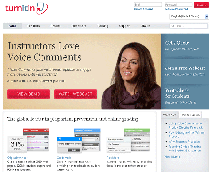
iParadigm’s suite of websites echoes the use of particular colors and images meant to persuade readers to partake of the service. Historically, Turnitin.com has always relied upon a bold color scheme of red, blue, and white, a palette that reinforces many common tropes about plagiarism and integrity, such as “getting caught red-handed”; an early testimonial on the iParadigms website, in fact, gleefully described catching several students “red, green, orange and yellow-handed” (“iParadigms Testimonials,” n.p). The image below shows an early instantiation, approximately 2008, of Turnitin.com's front page; the heavy use of red and white and the emphasis on "A" grades and poring over a paper for originality are indicated in the icons.

Today, Turnitin's main page relies on a red, white, and blue color scheme and there is a greater emphasis on textual materials describing results, webcasts from "prominent educators," and, as noted earlier, repetition of effectiveness, improvement, and timesaving.

The red, white, and blue additionally evokes U.S.-centric cultural assumptions about plagiarism despite the growing number of students enrolled in American higher education who come from cultures that recognize plagiarism differently (or not at all). What is reinforced through the design of these sites: battlefields, plagiarists, kidnappers of intellectual property? Do the sites assume culture-bound assumptions about the nature of authorship without considering the wide variety of definitions and understandings of "plagiarism" throughtout the world? Do the sites encourage viewers to feel they are members of an academic community working in harmony toward the shared goal of better writing—or as gatekeepers of integrity bound to root out and punish plagiarists in the classroom?
index ![]()
![]() the specter of internet plagiarism
the specter of internet plagiarism ![]()
![]() the turn to turnitin.com page 1
the turn to turnitin.com page 1 ![]() page 2
page 2 ![]() page 3
page 3 ![]() page 4
page 4 ![]() page 5
page 5 ![]() page 6
page 6 ![]()
![]() authorship and anxiety page 1
authorship and anxiety page 1 ![]() page 2
page 2 ![]() page 3
page 3 ![]() page 4
page 4 ![]() page 5
page 5 ![]() page 6
page 6 ![]()
![]() critical assessment
critical assessment ![]()
![]() references
references

