Doing 2-D Design: “How Disparate Pieces can be Ordered into a Cohesive Whole”
As an undergraduate majoring in graphic design, one of the first college classes Lindsey took was Two-dimensional Design, a demanding studio course that introduced students to basic principles of design including color, shape, orientation, line, and patterning and the processes and practices used by graphic designers. Describing the course, Lindsey stated that it focused on coming up with “workable” designs consistent with those basic principles and in ways that weren’t “obvious” or “predictable.” As she explained, “In graphic design, you are aiming to control the viewer’s eyes, where they go and when, what effects they perceive, how the elements of a piece work together. If you can’t achieve this, then your design doesn’t ‘work’ or ‘hold up.’” Throughout the semester, students learned these principles by planning and executing a series of visual projects by hand using paper, pencils and pens for sketching and inking along with other tools (e.g., glue, tape, scissors, X-ACTO knives). Doing it by hand, Lindsey indicated, encouraged students to commit to an idea and think about it carefully.
According to Lindsey, the professor devoted a great deal of attention to invention practices, particularly in terms of the arrangement of various elements of the design. Discussing the kind of textual practices that the instructor modeled and that she and other students employed as they worked on their projects for the course, Lindsey described a series of practices for physically manipulating texts, including drawing figures in the sketchbook she used for the course, cutting shapes out of the sketchbook and arranging them on her table, orienting them in different directions, experimenting with different sequences, taping workable configurations together, and so on until she found a design that worked. Lindsey described her basic approach to her designs in the following way:
I would sit and wait to be struck by the idea. I’d create a shape, turn it, pair it with another, create another shape, roll it over … sometimes it felt like aimless invention. I wasn’t sure what would be considered obvious, dull, boring. I was even less sure about what might be lauded as genius. Since we had to do everything by hand, I got used to sketching out the shapes and patterns before inking in a template. Before I could commit to a graphic, shape, pattern, or placement, I would draft and revise the thing endlessly.
It is through this recursive process of creating graphic representations and physically orienting and moving them that Lindsey was able to envision and enact a workable design, one that wouldn’t appear “obvious, dull, [or] boring” from the perspective of a graphic designer.
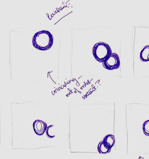
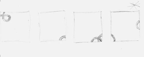
In order to get a clearer sense of the textual practices involved in this type of work, Lindsey was asked to select one particular project that would serve as the focus of a series of text- and artifact-based interviews. She chose what she referred to as the “rings project,” a task that explored ways of depicting the spatial relationships between two shapes by arranging two rings in relation to one another in a series of different orientations, with the ultimate objective being to come up with a series that would guide the viewer’s eye along a particular path through four small panes. According to Lindsey, the initial steps toward generating her design involved sketching various panes and configurations of panes in her sketchbook to experiment with different ways to orient the rings in relation to one another within each pane and across different combinations of panes. For the first week or so [after getting the assignment],” Lindsey recalled, “I was constantly sketching panes and rearranging them in every imaginable sequence in sketches in my sketchbook.” According to Lindsey, the continual sketching and rearranging was necessary because “[as] our content was so limited, I had to focus most of my energy on the arrangement, how disparate pieces could be ordered into a cohesive whole.”
In the brief video below, Lindsey describes her creative process for the rings project—the sketching of different orientations of the rings in her sketchbook and then moving her sketches around in different configurations.
In the initial portion of the video, Lindsey points to some of the different configurations of rings she drew in her sketchbook as she experimented with an effective visual pattern to guide viewers' eyes. Using her finger to trace the visual pathway across the sequence of four panes running down the right-hand side of the page, Lindsey states that this path might have been "too predictable" to catch the viewer's attention. Turning her attention to the series of panes cascading down the left-hand side of the page, Lindsey uses her fingers to indicate that the visual pathway is disrupted by how the rings in the second and third panes are configured. In the latter portion of the video, Lindsey discusses how she started her work on the rings project by sketching different configurations of rings on the pages of her sketchbook during class to get a sense of which relationships she might want to use. Having determined the basic configurations of rings she wanted to use, Lindsey then indicates that she started experimenting with different sequences of panes by physically rearranging them. Here, Lindsey recalls physically arranging the series of panes for the rings project on the table in her home, but she indicates that she rearranged images for another project on the walls and bathroom mirror of her apartment.
Describing during a later interview the process of arranging and re-arranging sequences of panes for the rings project, Lindsey stated,
I cut some of the panes out of the sketchbook or re-did them larger on other pieces of paper. Then I rearranged them in different combinations on my desk. When I saw something that worked, I taped the pieces of the project up on the wall above my drafting table and then continued to rearrange the pieces over the course of the next few days. When I liked a certain sequence or arrangement, I sketched it out on a piece of paper, or if it was a series of only four panes or so, I numbered them and recorded the various combinations that worked. Every now and then I sketched a new pane to replace one of the ones on the wall.
For Lindsey, this process of physically manipulating panes by moving them around, numbering them to keep track of various sequences of panes, and taping panes together as a way to stabilize particular orderings was much more effective and efficient than constantly sketching and re-sketching the entire series of panes every time she wanted to try a particular sequence.
Executing the final version of the project was basically a matter of creating a much neater version in ink of what was taped up on her wall. As Lindsey stated, “The sketched, pasted, and taped final version of the project was a template that I used. I simply copied it over, reproducing it in a cleaner, larger, sharper manner, staying up all night to ink it.”
Although each of the class’s other five projects emphasized different design concepts, Lindsey found that she could employ a similar process of sketching, cutting, taping, arranging, and re-arranging to complete them. For example, for the gradation project, the project Lindsey describes in the initial portion of the video featured in Chapter 1, Lindsey immersed herself in creating a particular pattern of shapes and then depicting that pattern as it changed shape, size, or orientation subtly over dozens of small panes. Describing her work for the gradation project in a different interview, Lindsey stated,
for the project on gradation, which required that I ink a very intricate pattern and reproduce it twenty or so times, I needed to be certain that I had the core pattern down and I had to envision this strip as a part of the larger whole that I wouldn’t see until the project was finished, some twenty to thirty hours later. In order to save time, I learned how to draft and revise the pattern by cutting off pieces that weren’t quite right, taping on possible additions—loosely at first with masking tape—folding portions of the patterned strip back to see how it fit with a new design or segment I’d been working on, and rearranging bits of the pattern until I got it the way I wanted it. I wouldn’t know what “it” was until I saw it.
As with her process for the rings project, the process Lindsey describes for the gradation project involved physically manipulating a representation by cutting, taping, and folding as a way to envision how the entire gradient would look without actually having to draw the gradient in its entirety.
In “Drawing Things Together,” Bruno Latour (1990) wrote that “scientists start seeing something once they stop looking at nature and look exclusively and obsessively at prints and flat inscriptions” (p. 39). In the same manner, it was only once Lindsey began to sketch her representations of rings and to shuffle them around on tables and walls that she was able to generate a design valued by graphic designers. Used in conjunction with other discursive practices, such as the numbering system Lindsey used for keeping track of sequences of panes, the physical ordering and re-ordering of graphic representations allowed Lindsey to make readily visible the representations she was working with, experiment with different configurations of those representations, and discover how they might best be arranged into a coherent design. In other words, Lindsey’s ability to see the relationship between shapes in ways valued by graphic designers was accomplished through the competent deployment of the physical manipulation practice she used to transform the world into the categories and events that are relevant to the work of graphic design. It is the encounter between this practice and the sketched representations of rings, rather than the final resulting design, that is the key locus of graphic design, the real work of this disciplinary world.
In the next section, we detail Lindsey’s repurposing of this discursive practice from the invention and production of visual arguments for graphic design into the nexus mediating the invention and production of written arguments for a literary analysis at three key stages of her writing process: discovering an initial argument, generating a suitable strategy for developing that argument, and arranging specific quotations to support her main points.


