01. Thinking through Data Visualization
Leveraging the Exploratory Power of Figures to Create WPA Knowledge
Introduction
In our 21st-century age of accountability, writing program administration involves data-driven problem-solving. As Chris M. Anson (2008) has argued, WPAs must supply data on enrollment, retention, and student performance to provide rationales for their work to audiences of upper administrators, students/parents, and the public. Posing this reluctant, compulsory relationship to data, however, limits the scope of WPAs’ work with data and misses important opportunities to leverage programmatic data in the service of agendas informed by writing studies’ own disciplinary knowledge and the distinctive missions of individual programs and institutions. Patti Poblete (2014) calls on WPAs to adopt a proactive stance toward programmatic data—rather than reacting to assessment mandates from outsiders, whose understandings of writing often clash with the field’s knowledge about writing development—using disciplinary touchstones like the “Framework for Success in Postsecondary Writing” to ensure that program assessment is valid from both disciplinary and institutional perspectives. Exploratory data visualization offers one mechanism for responding to Poblete’s call, capitalizing on and expanding the data writing programs collect to record the many situated, embodied factors writing studies recognizes (including placement procedures, instructor training, pedagogical approach, and course scheduling) as affecting the outcomes that external stakeholders typically prize. WPAs can use the additional data they collect to explain outcomes, tie them to budgetary and other constraints, and advocate for additional resources using the kind of quantitative data that resonates with external stakeholders, generating findings that both serve program needs and create new disciplinary knowledge.
Fortunately, WPAs already have access to much of the additional data needed to more fully document the writing instruction and development going on in their programs, for example via basic scheduling information (discussed in this chapter) or via Learning Management Systems (LMS) that capture student/instructor interaction and student performance (see Lang, 2016; Moxley & Eubanks, 2016). Challenges to data visualization arise, however, in the creation and interpretation of figures, since most WPAs are not data scientists and graduate training in writing studies typically includes little (if any) training in quantitative analysis. To address this gap in expertise, we
- discuss the intellectual work of writing program administration involved in programmatic data mining,
- offer an exploratory visualization tool (the alluvial diagram) for investigating the relationships between the manifold types of data WPAs typically have access to, and
- offer sample applications for this data tool (figures) that show how the conclusions drawn from different configurations of the data might be used to communicate with outside stakeholders about the characteristics and needs of a writing program.
Course Scheduling as a Test Case for Data-Driven WPA Learning and Decision-Making
Course scheduling represents the kind of data-driven, multifactor administrative challenge WPAs often deal with, encompassing multiple variables such as number of students, size of budget, number of classrooms, classroom capacities, number of instructors, and instructor availability. Scheduling is often dismissed as a mundane, nonintellectual aspect of WPA work: calculating the number of sections the writing program will offer, placing sections into classrooms with sufficient capacity, and assigning instructors to sections. However, as WPAs know, this “simple” responsibility is extremely complicated and often highly contentious, affected by fraught topics such as course caps, mandatory meeting of enrollment demands, hiring freezes, budget cuts, fluctuating instructor availability, disagreement over instructor workload and qualifications, attempts to secure livable instructor wages, disputed placement procedures, changing student enrollment trends, and lack of access to classrooms conducive to writing instruction. Making decisions in the face of these competing demands—some relating to quantifiable resources and demands, others determined by disciplinary knowledge about best practices in writing pedagogy—requires WPAs to negotiate the relationships between the data they see in light of their knowledge of writing instruction and writing program administration, drawing relationships between variables in order to decide how to balance the competing demands of stakeholders inside and outside the program.
Course scheduling involves both academic and nonacademic units, leading WPAs to negotiate issues like budget and scheduling priority with stakeholders ranging from other academic programs (including the English departments in which many writing programs are housed) to deans and upper administrators to nonteaching units like the Registrar and University Scheduler. These institutional audiences are particularly likely to trade in data-based proposals, underscoring the need for WPAs to engage in this discourse using their quantitative data conventions. Rather than seeing these stakeholders as imposing problematic empiricism on WPA work, Louise Wetherbee Phelps (1991) argues that the integration of activities typically classified as teaching, research, and service in writing studies as a discipline, and especially in WPA work, means that our own disciplinary traditions and knowledge call on WPAs to bring data-driven problem-solving (a “research” activity) to bear on the task of scheduling (an administrative activity often equated with service). Indeed, this linkage of data and disciplinary knowledge, which forms the heart of WPA work, often consists of interpreting quantitative data through the lens of WPA and writing studies theory. James Porter et al. (2000) underscore this point: The applied nature of WPA work makes it intellectual work par excellence, testing and developing theories in the “real world” by applying them to a complex, infrastructural bureaucracy and using the data and outcomes generated to constantly refine the program itself, illustrated in Susan M. Lang’s (2016) application of lean managerial practices to writing program administration.
Administrative work isn’t mindless bureaucratic drudgery in the hands of a WPA informed by programmatic data and disciplinary knowledge: When performed as data-informed intellectual work, writing program management becomes a way for writing studies standards and knowledge to inform the daily lived experience of students and instructors, supporting equitable, just instruction (see Miller, 1998). Data visualization provides a vehicle to recognize and demonstrate this work. Using course scheduling as an example, we propose a figure—the alluvial diagram—as a tool WPAs can use to make sense of datasets with multiple sets of variables whose units could be specific courses, students, instructors, etc., depending on the data collected and the purposes of the WPA. This kind of visually driven, data-based invention is critical for teasing out what data shows, and provides guidance for WPAs in the process of applying their disciplinary knowledge to datasets to both seek causes of writing program outcomes and propose solutions supported by evidence (and depictions of it) that speak to the values of accountability-focused stakeholders.
Methods
Data & Analysis
Data & Analysis
Our figures depict data from a 2017–2018 survey of WPAs1 at 120 North American colleges and universities circulated via open invitations on the WPA-Listserv and direct invitations to a representative sample of institutions of different sizes and types.2 The survey asked about
- program name (supplied by respondents);
- courses offered (selected from a controlled vocabulary including first- year writing, basic writing, courses for English language learners, business writing, technical writing, advanced writing, digital writing, rhetoric major courses, and other);
- process for determining number of course sections (open-ended response);
- process for placing course sections into classrooms (open-ended response);
- types of classrooms used across the program and for specific course types (controlled vocabulary of classroom types [lecture halls, traditional classrooms, computer classrooms, active learning classrooms,3 online, or other]).
Participants’ course and classroom scheduling responses were coded inductively (following Miles, Huberman, & Saldaña, 1994), with coders developing descriptive codes to denote stakeholders mentioned in open responses. Coders then consolidated these first cycle descriptive codes into second cycle pattern codes, resulting in the stakeholder and procedure categories reported below. This coding procedure reflects the fact that this was exploratory research attempting to identify scheduling stakeholders and processes; as such, it did not rely on prior research to develop a controlled vocabulary or code deductively. Stakeholder and scheduling process coding was verified by two independent coders. This data was then visualized for interpretation using alluvial diagrams.
Alluvial Diagrams
Initially used to depict currents in rivers, alluvial diagrams visualize flows across different nodes in a system with an emphasis on interactions across multiple dimensions. Because of their ability to visualize complexity, alluvial diagrams are suited to depicting:
- “a many-to-many mapping between two domains [e.g., universities and majors] or
- multiple paths through a set of stages [for instance, Google Developers uses Sankey diagrams (a variant of alluvial diagrams) to show how traffic flows from pages to other pages on your website]” (Google Developers, 2017).
The composition of alluvial diagrams includes nodes (unique items), steps (groups of nodes organized vertically by categories), and flows (links between nodes across steps), illustrated in Figure 1 below. Through this structure, alluvial diagrams can capture how variables group and disperse from one dimension to the next.
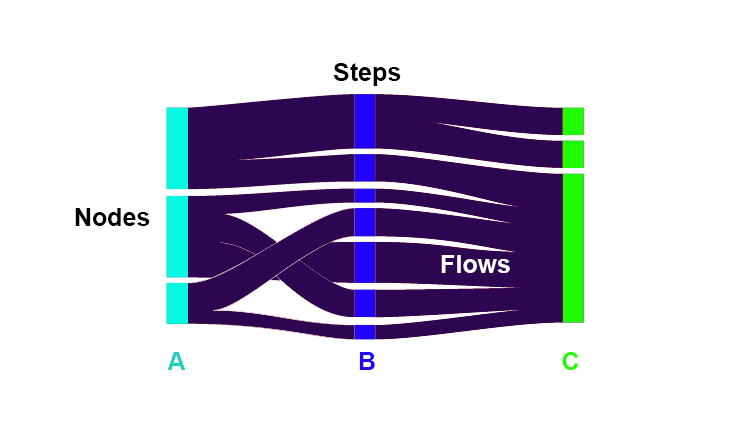
Figure 1: Mock alluvial diagram (Google Developers, 2017), with components identified.
Once the component parts are identified, there are multiple ways to read this visualization: choosing one node and following its path from the left to the right side of the visualization, identifying the flows based on size, or identifying where nodes might converge and then diverge. For example, in Figure 2, readers can begin from left to right, focusing on a specific academic year and student status to see graduation outcomes. Or, readers can begin with graduation outcomes and read right to left to identify characteristics of students who have dropped out, graduated, or continued their studies. Additionally, readers can focus on one step, like academic year, to identify the trends for each school year and how they change over time. This relatively simple example (with only two steps) illustrates the interpretive potential of alluvial diagrams.
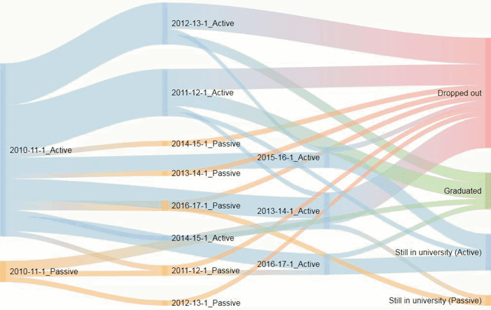
Figure 2: Sample alluvial diagram: Horváth, Molontay, & Szabó (2018) visualize university students’ matriculation over time to tease out patterns in graduation and school-leaving. (Note: The embedded caption (b) appears in the original context.)
By using the structure of alluvial diagrams, WPAs can create administrative figures that visualize relationships without reducing complexity. (See Appendix for tools and guidance on how WPAs can create alluvial diagrams to visualize their own data.) For example, Figure 2 allows Horváth, Molontay & Szabó (2018) to follow students’ progress toward matriculation as they maintain current standing or go inactive across a six-year timespan.
Following in this tradition of presenting data in its complexity, the following sections contain alluvial diagrams constructed from the course scheduling data supplied by WPAs at participating institutions. These examples illustrate how alluvial diagrams can be used to explore programmatic data and generate further inquiry, to draw comparisons and generate data-driven arguments to outside stakeholders, and to inform policy statements.
Alluvials for Correlation: Using Data to Promote Focused Inquiry
As WPA researchers know, the diversity of writing programs and the institutions in which they are located makes it difficult to develop generalizable findings, especially because writing studies’ investment in rhetorical theory imparts meaning to the particular names and structures that constitute each institutional and programmatic context. Unwillingness to limit complexity by flattening distinctions makes writing program data unruly, which has contributed to the field’s reluctance to embrace quantitative data due to concerns about it being dehumanizing and decontextualized (see discussion of the limitations of traditional assessment approaches; Yancey, 2018). But because alluvial diagrams enable the visualization of multiple flows across multiple steps, the complexity of multivariate data can be retained to play a greater role in its interpretation. Figure 4 shows data from relationships across programs, stakeholders, and decision processes in placement procedures, comparing point of origin of the initial proposal for the number of course sections to the name of the unit functioning as the writing program, and then mapping out the stakeholders involved and connecting these to the ways local conditions affect scheduling.
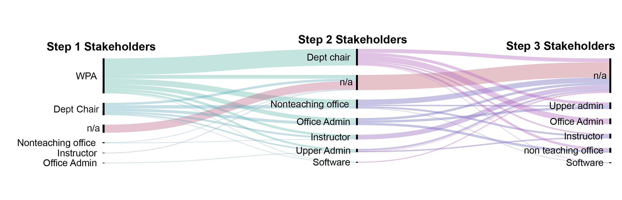
Figure 3: An alluvial diagram visualizing the stakeholders involved in course scheduling decisions. Stakeholders in each step are listed from top to bottom in order of largest to smallest group. With each step, the largest stakeholder group is removed, which is why WPA is absent from Step 2 and Dept chair is absent from Step 3. N/a denotes “not answered,” reflecting the fact that some survey respondents only identified one or two stakeholders, while others did not identify any stakeholders at all. This is why, as the number of stakeholders increases across the diagram, the n/a proportion of each step increases, since respondents named an average of 2.89 scheduling stakeholders.
For example, in Figure 3, nodes gather across Step 1 to reflect that, for a majority of survey participants, WPAs play a role in determining the number of sections of the courses their writing program offers, rather than receiving this as a mandate from another unit (such as upper administrators). The steps in Figure 3 illustrate participation in placement decisions, but not chronological order of participation or degree of control over the scheduling process. Instead, these steps show different combinations of stakeholders, based on frequency. For survey respondents that only listed one stakeholder, those variables became Step 1. For survey respondents that mentioned two or more stakeholders, those variables were placed across Steps 2 and 3 based on the prevalence of those combinations. For example, survey respondents mentioned WPAs most frequently in relation to other stakeholders. However, no respondent mentioned upper administrators or software alone, which is why they’re absent from Step 1.
Tracking the WPA flow to Step 2 illustrates that a majority of scheduling for writing courses is either shared with department chairs, or the sole responsibility of WPAs. WPAs’ central role in determining the number of sections is significant because it means they can draw on their own knowledge of pedagogical best practices, instructor skills and needs, and programmatic agendas to help determine this figure, working within the need (as Figure 4 shows below) to match their course offerings to enrollment. For institutions that identified two or more stakeholders as involved in course scheduling decisions, Steps 2 and 3 capture the involvement of other stakeholders in placement processes, illustrating that as the number of influencers increases, stakeholders who are increasingly removed from disciplinary expertise in writing studies (upper administrators, such as deans), nonteaching offices (such as the registrar), office admin staff (such as administrative assistants or office managers), and scheduling software (such as Banner) are included in the process. Visualizing the data this ways helps raise questions about the effects these different configurations of stakeholders have on the course scheduling process, suggesting, for example, the utility of adding data about institution type or size and/or following up with individual respondents who fall into various profiles to tease out the specific impacts these different stakeholders have in order to consider the extent to which different stakeholder configurations are conducive to writing programs shaping their course offerings according to writing studies’ disciplinary knowledge.
Although this figure shows survey data gathered from many campuses, a figure like this could be used to trace the impact of policies that impact individual writing programs, where a single decision suggests a cascade of effects. For example, WPAs might use alluvial diagrams to trace the impact across multiple terms/years of policies like
- different placement procedures/outcomes,
- changes in writing credit given for pre-college AP/IB/dual enrollment, or
- exposure to different first-year writing curricula (themed, WAW, etc.).
Using alluvial diagrams, WPAs could use students’ grades, pass rates, and retention to track the impact of decisions like these to create a more complex picture of how local policies and curricula affect student outcomes across multiple dimensions, allowing for the depiction of outcomes in relationship to each other, reflecting the complex nature of writing development. Such ambiguous outcomes are ideal candidates for further research, identifying successes and challenges that can become the focus of additional data collection, policy recommendations, and/or new research projects.
Alluvials for Comparisons: Where Is Writing Being Taught?
The impact classroom conditions have on the delivery of writing instruction occurs anecdotally in informal conversation among instructors and via case study in the pedagogical literature (see Reynolds, 2004; Nagelhout & Rutz, 2004). The recent flourishing of scholarship on the design, use, and assessment of purpose-built spaces for writing (see Carpenter, 2013; Gierdowski, 2013; Carpenter et al., 2015; Purdy, & DeVoss, 2017) provides inspiring case studies of the process of creating and the possibilities for teaching in writing studios, multiliteracy centers, and active learning writing classrooms. What’s missing from this scholarship is a sense of the impact such innovative spaces are having (or not) on writing instruction as a whole. Figure 4 shows the distribution of writing courses across classroom types at surveyed institutions, illustrating the reliance on the use of traditional classrooms, the impact of computer classrooms across course types like technical and digital writing (despite their expense and the trend toward BYOD approaches), the relatively small proportion of online writing courses, and the negligible use of active learning classrooms with mobile furniture and student-accessible display technologies for writing instruction (especially as writing courses become more advanced).
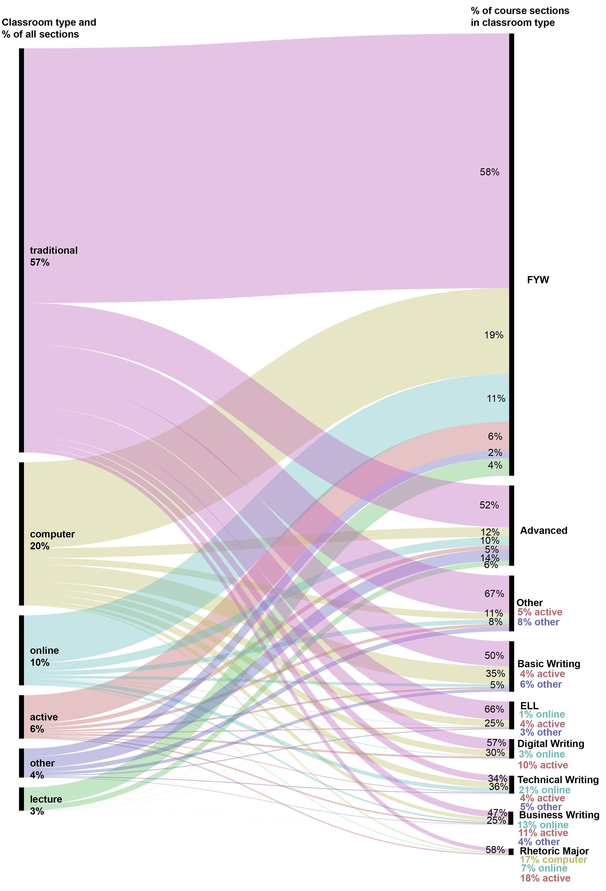
Figure 4: This alluvial diagram illustrates distribution of courses across classroom types. The nodes on the left side of the diagram represent different types of classrooms and percentages of sections taught in them across all courses. For example, 20% of all types of course sections are taught in computer classrooms. The nodes on the right side of the diagram show how classroom types are distributed across courses. For example, 50% of FYW sections are taught in traditional classrooms, while 4% of FYW sections are taught in lecture halls.
Filling in the gap in writing studies research about the classrooms in which writing is taught, Figure 4 shows the unfortunate, though unsurprising, prevalence of traditional classrooms as sites for writing instruction. ELL courses are particularly likely to be taught in traditional classrooms, suggesting that these classes may have lower status even than other writing courses, or that ELL courses are most commonly offered at institutions that rely more heavily on traditional classrooms rather than having access to infrastructure that better supports writing as a social, iterative process (such as computer or active learning classrooms). One major question raised by Figure 4’s field-wide snapshot is the disparity between classroom infrastructure and pedagogy in courses reliant on technology. Although technical writing and digital writing courses—in which digital composing technologies play a central role—are more likely than other writing courses to be taught in computer classrooms, this still accounts for only about a third of cases, highlighting clear infrastructural obstacles to the pedagogy of these courses. On the positive side, Figure 4 shows that the use of lecture halls for writing instruction is fairly rare, making up less than 1% of classrooms used for basic, ELL, technical, and digital writing courses. The data Figure 4 reports about the rare use of lecture halls for first-year and advanced writing suggests specific courses where classroom placement advocacy may be most necessary, since these widely offered, general education writing courses seem at greatest risk of being scheduled in classroom types least conducive to writing instruction.
Applied at an individual institution, such a figure could capture the material conditions of writing instruction, and, when layered with course descriptions framed in terms of learning outcomes, could serve as a compelling argument to outside stakeholders (such as the nonteaching and upper administrative units involved in course scheduling) for the need to prioritize locating writing courses in rooms with features like flexible furniture (characteristic of active learning classrooms) or built-in technology (i.e., computer classrooms). Such figures could also serve as an argument for remodeling existing classrooms or building new ones, since the interweaving of the diagram’s flows underscores the zero-sum nature of classroom space: prioritizing one course’s placement in desirable classrooms necessarily reduces other courses’ access to them. As a device for invention, this figure reflects back to the WPA what’s happening in their program, transforming information listed in scheduling spreadsheets into a visual that illustrates trends across courses. As a device for persuasion, along with information about course goals, the alluvial illustrates the disparity between curriculum and delivery, demonstrating the scale of the problem, which WPAs can leverage to argue for better/more resources. As Julia Voss (2020) argues, assembling programmatic data to investigate writing program practices according to disciplinary best practices in writing instruction shows WPAs what is going on in their program and forms the basis of proposals to outside stakeholders for additional resources and policy changes.
One of the major advantages alluvial diagrams offer is their ability to visually suggest changes that could be made in the allocation of finite resources like classroom space. Although building new classrooms or remodeling existing ones to better suit writing pedagogy might be a long-term goal, alluvial diagrams’ ability to bring together the multifaceted issue of classroom type across courses can help WPAs prioritize which courses must use specific classroom types (for example, computer classrooms, active learning classrooms) and which ones can be accommodated—if with difficulty—by other classroom types (traditional classrooms, lecture halls) in order to avoid the most damaging pedagogical mismatches. With this information in mind, WPAs can account for classroom availability in annual program planning, adding considerations of the necessary infrastructure for the kinds of writing done in each course to the existing focus on meeting student demand, distributing instructors’ workload, etc.
Alluvials for Distribution: Generating Disciplinary Best Practices
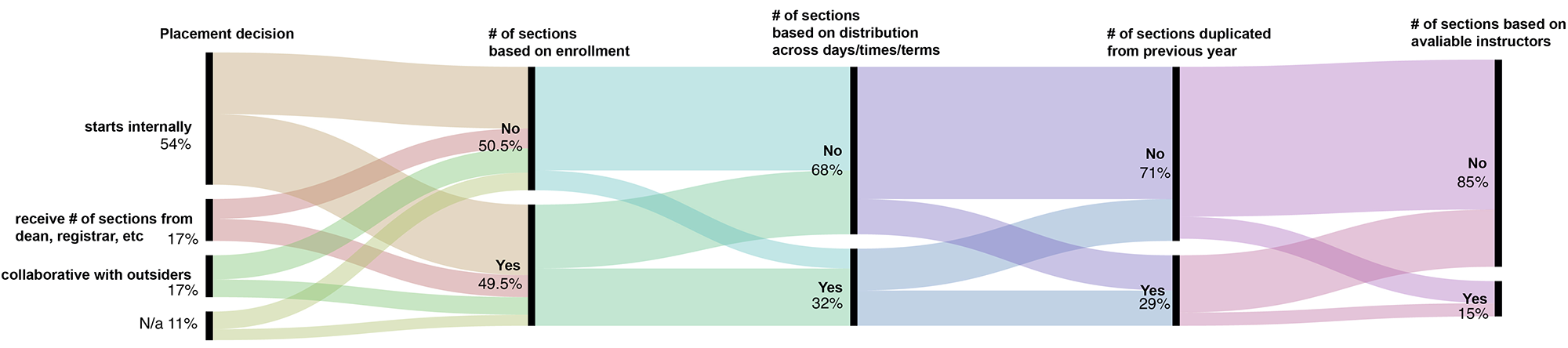
Figure 5: An alluvial diagram illustrating relationships between programs, stakeholders, and section creation in placement procedures. The nodes of this diagram show the procedures for developing the schedule of writing courses, beginning with the schedule proposal’s point of origin and flowing through a series of nodes showing the use of different scheduling parameters which are organized left to right in descending order to frequency. Some survey responses did not identify scheduling stakeholders, denoted by n/a for “not answered” in Step 1.
Figure 5 extends the institutional course scheduling relationships shown in Figure 3 to consider the influence of local policies and conditions, considering the extent to which enrollment, physical facilities (distribution imperative), program history, and instructor availability impact course scheduling. Survey data showed that the most common scheduling procedure was to rely on enrollment data, followed by replicating the number of sections from the previous year, followed by distributing sections across days/times, and lastly by the number of available instructors. One strength of the alluvial diagram is its ability to easily visualize which of these scheduling procedures are used together, and which are not. Figure 5 shows, for example, that many programs that use enrollment data and distribute sections across days/times do not replicate the previous year’s schedule, suggesting a tighter tailoring of course offerings to enrollment data, which can create problems for institutions where late enrollment is common and/or where reliance on contingent faculty means that this results in last-minute hiring that violates professional ethics and harms student learning. The relative rarity of using the availability of instructors to schedule courses is also useful, suggesting the positive finding that shortages of qualified teachers typically do not drive scheduling decisions.
Moving from local campuses to national comparisons, gathering this kind of data on a large scale across multiple programs could help WPAs as a professional community develop data-informed best practices for course scheduling that can serve as warrants for arguments for WPAs on individual campuses. Thinking back to the questions raised by Figure 4, considering the factors that determine the number of sections focuses our attention on the relationships between different scheduling stakeholders, the factors they consider when making scheduling choices, and considerations like institution type, institution size, and location of writing program. Figure 5 might suggest best practices WPAs can call for at their home institutions to create course schedules; for example, requesting access to specific types of data from other units to support effective scheduling or resisting pressure to allow instructor availability to dictate course scheduling in the form of refusals to fund searches or additional appointments.
The requests for research on the related phenomenon of class sizes for writing courses, periodically posted on the WPA-Listserv by WPAs resisting mandates to increase writing course caps, illustrates the utility of formal research on this subject, substantiated by replicable, aggregable, and data-supported (RAD) research that confers transcontextual, generalizable authority. As many WPAs know, one of the most useful distillations of this research comes from statements of professional standards and knowledge made by the field’s professional organizations, such as existing position statements and resolutions like the WPA Outcomes Statement for First-Year Composition and the Conference on College Composition and Communication’s (CCCC) position statement, CCCC Principles for the Postsecondary Teaching of Writing. Similar to the Council of Writing Program Administrators’ (CWPA) Portland Resolution and statement on Evaluating the Intellectual Work of Writing Program Administration, a statement articulating the role WPAs should have in course scheduling would shore up the description of WPA work found in these earlier foundational statements and would provide disciplinary support for WPAs seeking to take more responsibility for the delivery of instruction in their programs by involving themselves more fully in the process of course scheduling. Furthermore, grounding that statement in data linking writing program practices and outcomes—as Randall McClure et al. (2017) call for—creates conditions for translating discipline-endorsed best practices into concrete programmatic practice.
Takeaways
The approach to thinking with and through data described here encourages WPAs to interrogate data according to their own priorities as writing experts, rather than doing so at the behest of outside stakeholders like upper administrators or accrediting agencies. Because of the complex way writing studies understands writing development and the multiple factors that affect it, a sophisticated tool like the alluvial diagram offers a way to visualize data relationships in ways that more familiar formats like spreadsheets and bar charts do not. The three cases presented here consider how programmatic data relating to scheduling can be leveraged to identify areas of interest/concern for further investigation, to illustrate problems and tinker toward solutions, and to generate new disciplinary standards that can help WPAs intervene in local structures with the backing of disciplinary expertise and authority. These perspectives, combined with the tools provided for creating alluvial diagrams using local data (see Appendix) and the description of how to interpret alluvial diagrams, encourage WPAs to approach data with curiosity motivated by the desire to apply (and even interrogate) writing studies’ disciplinary knowledge using local conditions, enacting the kind of intellectual work of administration described by Phelps (1991) and Porter et al. (2000). Using alluvial diagrams for invention suggests an embrace and normalization of the kind of data-driven inquiry Anson (2008) called for in response to outside criticism of writing program outcomes. However, initiating this kind of programmatic inquiry themselves positions WPAs as question-askers rather than respondents, setting them up to define the terms of data-driven conversations about policies affecting the delivery and outcomes of writing instruction.
Notes
1. Not all participating institutions had an official WPA. For some institutions (especially liberal arts colleges and community colleges) the survey was completed by someone acting as a WPA but whose titles ranged from department chair to dean to course coordinator. ↩
2. This list was developed by updating the one created by Wooten, Ray, & Babb (2016) to survey writing program directors/department chairs about their use of student evaluations. Our sample of writing programs includes:
- 11% 2-year colleges
- 7% 4-year colleges & universities
- 22% masters-granting institutions
- 60% PhD-granting institutions↩
4. “String” here refers to a word or phrase (as opposed to numbers), usually in the form of a controlled vocabulary that can be used to show frequency/proportion. ↩
References
Appendix: Tools and Resources for Creating Alluvial Diagrams and Data-Visualization Chart Types
Gathering Data
To visualize data with an alluvial diagram, create a spreadsheet (for example in Excel or Google Sheets), where each row corresponds to one variable and each column represents a dimension of that variable:
| Step A | Step B | Step C | |
|---|---|---|---|
| Node 1 | Number or string4 | Number or string | Number or string |
| Node 2 | Number or string | Number or string | Number or string |
| Node 3 | Number or string | Number or string | Number or string |
For example:
| FYW | ELL | AW | |
|---|---|---|---|
| Traditional classrooms | Yes | Yes | Yes |
| Computer Classrooms | No | Yes | No |
| Lecture Halls | Yes | No | No |
Or:
| FYW | ELL | AW | |
|---|---|---|---|
| Traditional classrooms | 85 | 10 | 25 |
| Computer Classrooms | 24 | 5 | 0 |
| Lecture Halls | 1 | 0 | 1 |
Preparing data
To create a visualization, your spreadsheet (and subsequently your data) needs to be consistently structured. For example, data that has multiple date formats (dd/mm/yyyy and d/m/yy) or multiple GPA formats (4.0 scale and letter grade scale) will be recognized by visualization tools as different criteria. These different formats for recording the same information need to be standardized. You can do a lot of this work in Excel or Google Sheets manually, with find/replace commands, or by creating formatting rules, but it can be tedious and—more importantly—runs the risk of missing some data (i.e., failing to remove all inconsistencies). These tools can help “clean” data for visualization more efficiently and accurately by locating anomalies and errors in your spreadsheets and performing batch changes to sets of differently formatted data:
- OpenRefine
- Tableau
- Google sheets
Visualizing Data
After your data is prepared and cleaned, explore different visualization types. The purpose of this exploration is to view your data with different elements highlighted to help you see trends in it that can prompt you to ask more specific, nuanced, or novel questions. For example, one visualization type might show you distribution of your data (giving you a sense of what its trends are), while another will emphasize relationships across variables (suggesting relationships or systems to investigate further). To explore what different chart types might reveal, The Data Visualisation Catalogue organizes charts by function (such as hierarchy, distribution, patterns, data over time, etc.), suggesting visualization types to experiment with. These tools offer a variety of visualization options (including alluvial diagrams) to help you look at your data through various different lenses: