Path 3. Visualizing Change
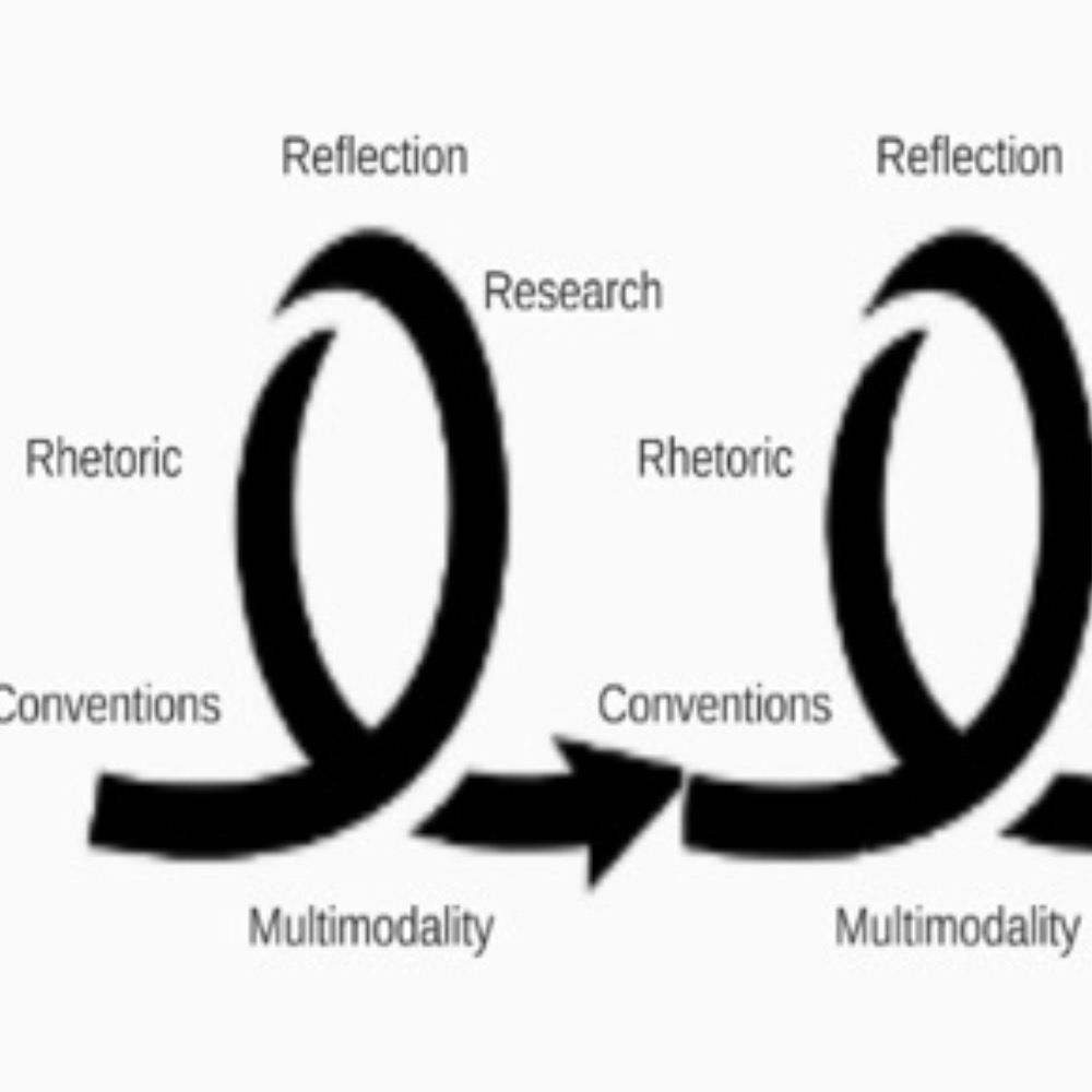
 Graphics have the power not just to represent change, but to enact change both in and over time. Chapters in this path show how graphics participate in pedagogical innovation, curricular development, and programmatic change.
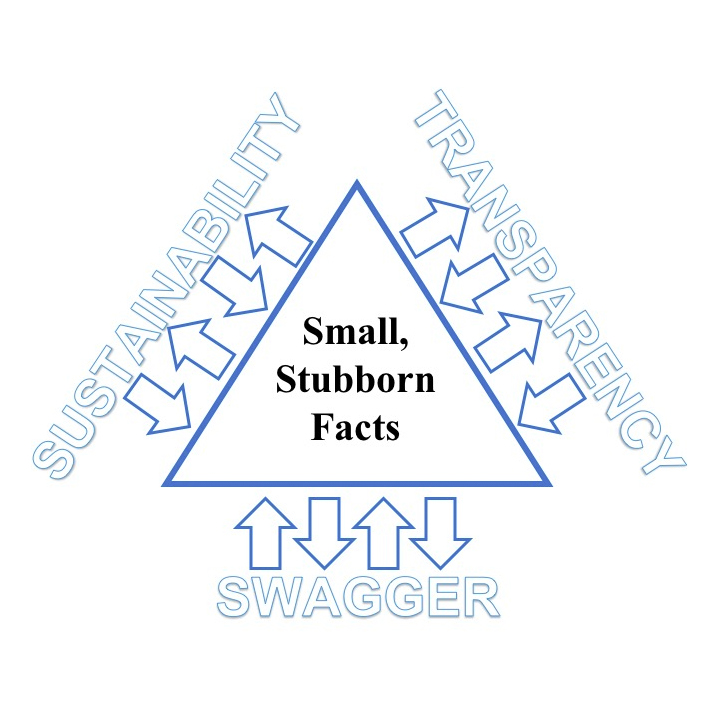
- 03. "Visualizing the Role of Small, Stubborn Facts: Changing Stories of Writers and Writing," by Ryan J. Dippre
- 05. "Diagram as Boundary Object: Incorporating Visuals into WPA Practice," by David S. Martins
- 06. "Designing to See, Mean, and Act: Giving Shapes to Programmatic Goals,” by Laurence José
- 11. "Maps, Stamps, and Plans: Using Visual Interactive Course Documents to Promote Student Autonomy and Engagement," by Andrew Lucchesi
- 12. "Graphic Re-Imaginings: Curricular Revision With/in/Through Programmatic Representations," by Logan Bearden
Writing Programs by Visual Design
The thing is that visual representations complicate things. We create a tidy verbal description of a program—a minor, a first-year composition program, a major—and, historically at least, that rendering has sufficed. More recently, influenced by work in multimodality and visual rhetoric, we’ve added the visual to the mix. In doing so, I often wonder, what is the intent? And perhaps more important, what is the effect?
In nearly all my classes, I ask students—which is more like directing them, of course—to engage in mapping activities. This term, in a graduate Digital Revolution and Convergence Culture class, students have created maps of circulation and maps of key terms. The circulation maps, which have ranged from depicting the Nepalese diaspora to plotting definitions of critical thinking, help students draw on their own interests to trace how people, objects, and ideas flow and merge and diverge and coalesce and redistribute. Students want the maps to articulate, to explain to others, but as Vygotskian mapmakers, they are also always plotting their own understandings.
Such plotting, however, looks very different—more contingent—in students’ design of the course’s key terms. For one thing, unlike the circulation maps (which receive a grade), mapping the key terms is an in-class, informal, grade-less activity, but as graduate students, they do not have to be persuaded that ungraded tasks matter. For another, students work in groups, so a (potential) negotiation among participants is built into this task design. And for yet another thing, they revisit the first map at least once, finding in the process, according to what they reported this week, that the structure won’t hold, that the set of key terms needs to be revised, that relationships aren’t mapped accurately. This visual plotting: it’s about relationships.
I’ve often taught Barton and Barton’s “Ideology and the Map: Toward a Postmodern Visual Design Practice”; the rules governing mapmaking, they assert, legitimate claims to power. One of their most convincing examples is the well-known London tube map, which—as it turns out—does a much better, a much tidier, job of describing the tube pathways than the territory above them. How we strike a balance between such competing impulses depends rather a lot on exigence: If I’m a novice traveler in London, I prefer the tube map; if I’m trying to learn about London itself, the tube map in its distortion is something of a hindrance. Taken together, the two maps do a much better job of visually describing London and its tube than either one does alone.
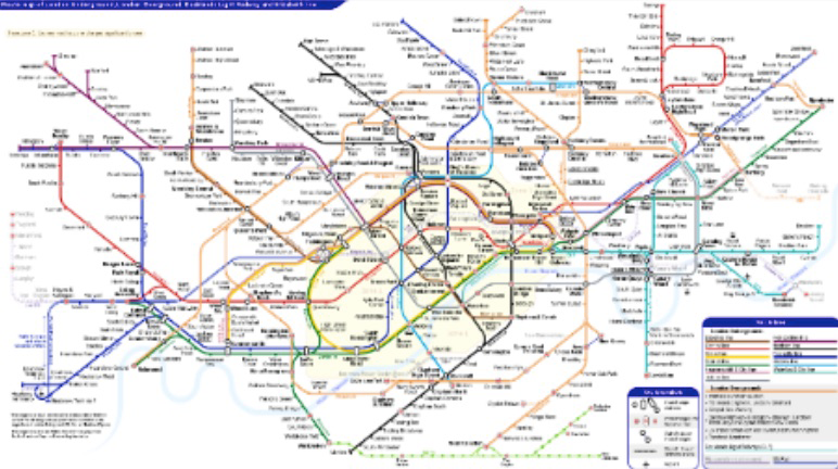
Figure 1. Example of London tube map.
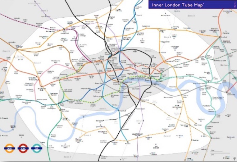
Figure 2. Additional example of London tube Map.
In thinking about this issue—how multiple visual representations construct and convey—I’m influenced by the pinup exercise that architectural students practice. Generally, in designing a project, these students rely on several representations and several kinds of representations: multiple drawings, some of the proposed project, others of the site, others of the site and the project, all “pinned” to a wall; models of the project adjacent to the pinup; metaphors circulating throughout the representations.
Collectively, these representations, fully multimodal, speak to the proposed project, as—literally—does the student orally presenting them. In working with students on ePortfolios, I’ve witnessed the same phenomenon, if for a different purpose, and the same principle, what we might call a principle of representational multiplicity. In ePortfolios, the principle provides for different portraits and perspectives, which together contribute to a fuller, richer representation: You wouldn’t create a portfolio to host multiple samples of the same genre in the same medium.
Moreover, it also seems that this principle of representational multiplicity is approaching ubiquity in everyday life: Renewing my driver’s license this year, I will have to bring multiple documents (e.g., passport, W2, social security card, utility bill), and every time I visit a doctor for some serious ailment, my body parts are represented in duplicate if not triplicate via MRIs, EKGs, CAT scans, and routine, old fashioned x-rays, all recording different slices of me for a kaleidoscope Yancey.
Interestingly, in developing materials for my courses, I haven’t always practiced what I’ve just been preaching above. I’ve long had a single syllabus, and at 12–15 pages, it runs on, especially after I insert FSU boilerplate text, but also because it’s highly visual—with banners and photos—and complete, every reading identified, every blog post assigned. In sum, it’s a single document assembling FSU boilerplate, my boilerplate (e.g., office hours, office location), and specific visual and verbal material for the class. Several years ago, however, I confronted its limitations as a kind of representation. Redesigning a course with a new focus on reflection, I was trying to determine the appropriate rhythm for reiterative reflective activities: they couldn’t occur too often, but they shouldn’t occur too infrequently either. Trying to map them on the syllabus wasn’t helpful: The real estate of the syllabus—long and discursive—was at odds with plotting the rhythm. What I needed was a text with a view from 30,000 feet. Thinking aloud, I decided to create a single-page map of the semester’s class: I began by creating a grid with one column for each month and rows for the classes—luckily, the class met just once a week—and then filled in each class cell with its weekly activities. Not a genius idea, really, but very helpful: I could see the semester-long course in a single glance and within that, the rhythm I was trying to create. What’s more, as valuable as this was for my curricular redesign, I knew immediately that it would be at least as helpful to students trying to plan their own workload: Students could use it as a guide to discern both the tempo of the class and the relationship of assignments to chronology. Thus was born (what I began calling) a “course on a page,” a document that now always accompanies my 15-page syllabus in a small gesture of representational multiplicity.
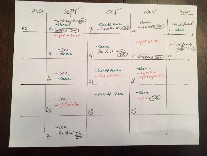
Figure 3. Sample "course on a page" document.
I’m pretty sure that my view of the power of visuals is influenced by a map I stumbled onto and then used in several presentations and publications. It’s not my map, and I didn’t create it, but in recontextualizing it for my purposes, I have made it my own. It’s a map of the continents overlaid on tectonic plates—or are the plates overlaid on the continents?—and I like it for several reasons, among them that it reminds me of the 1906 San Francisco earthquake, which my grandparents survived; that it enacts a representational multiplicity so as to depict each system and their relationship; that it’s so vibrant that I can almost see it changing as the tectonic plates shift; that it explains with very few words; and that it articulates precisely our current composing situation.
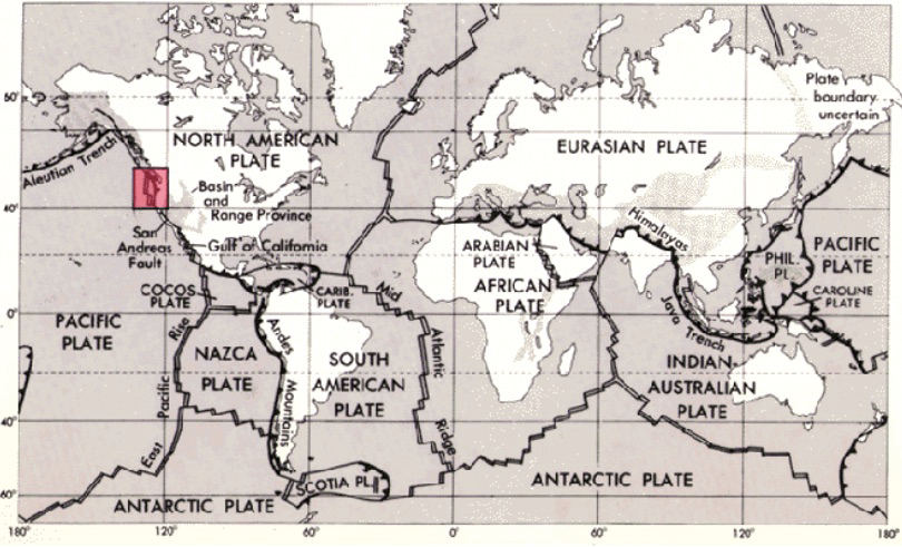
Figure 4. Map of tectonic plates.
I’m also pretty sure that my view of visuals is influenced by a student I taught at Clemson. A graphic design major, she didn’t like words much, preferring to express herself visually. Instead of describing her composing process verbally, she depicted it graphically, with one composing process map depicting her before-the-class version, a second the after-the-class version.
The difference between the two representations was stark: One composing process was abbreviated and thin and linear and arhetorical, like a flowchart, with no tangents and with no node or signifier for audience; the other version was elaborated and recursive and circuitous and audience-attentive. Even if my former Clemson student didn’t, or couldn’t, enact that second composing process, she knew what a powerful composing process looked like, and she was, I thought, much closer to adopting it as a function of having visualized it.
In 2012, while composing Writing Across Contexts: Transfer, Composition, and Sites of Writing, Liane Robertson, Kara Taczak, and I decided that we wanted to include a graphic showing the multiple sites of writing college students compose in. The graphic we created was simple, its points (1) to show that students move into higher education and then out of it, to “GRADUATION=JOB, MORE SCHOOL, LIFE,” and the writing they do in the interim facilitates this trajectory; and (2) to show that while they are in college, they write in classes and in many other sites, among them work, writing center, and co-curriculars. Looking back at this graphic now, the way it emphasizes COLLEGE WRITING CLASSES—through the placement of CLASSES at the center of the graphic and the circle’s size—I’m a bit uneasy: It seems wrong, or at the least not completely accurate. For one thing, it suggests that students take college writing classes in college, when many of them take some of those classes in high school via dual enrollment or advanced placement. For another, our research since that time has challenged what I think is orthodoxy about how writers develop: in school. Our most recent research,1 reported in the 2018 WAC Journal and a 2019 issue of College Composition and Communication, suggests that students develop as writers as much in some of these other sites as they do in classes—and perhaps more. Toward representing that model of writer development, I’ve developed another graphic depicting writer development from another perspective, the writer’s, and here classes are but one site, and not the largest or the central one. Of course, this visual is incomplete, too, but I’ve attempted to address that by offering different versions, with some students learning more in workplace sites and classes, others in classes, co-curriculars, and writing centers. Put the visuals together, and we’re onto something.
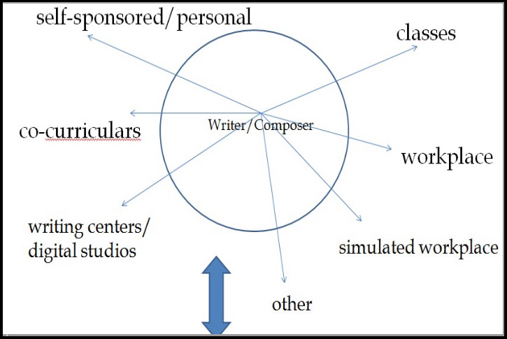
Figure 5. Graphic detailing possible locations of student writing.
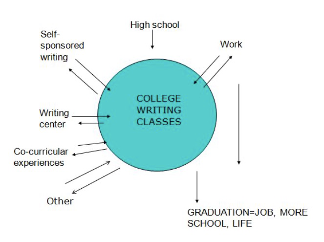
Figure 6. Another example of locations of student writing.
As a part of their design, some graphics seem to build in opportunities for connections, revisions, and different directions, be they one-time or continuing. In that sense, such graphics are like boundary objects: They have the capacity to toggle between different contexts. Or: in the language of this chapter, they have an inherent potential for representational multiplicity.
In planning the conference program for CCCC in New York City in 2003, I tried a small version of this in an alphabetic logo, drawing on a C that both conference and city share to create a temporary unity between them: NYCCCC. A more visual logo has represented the council of Writing Program Administrators since the early 1990s, as its then-past President Rita Malenczyk has explained. Appearing in the organization’s journal, conference materials, and letterhead, the logo is elegant and simple, consisting of four blocks, one each for the letters W, P, and A, with the fourth block hosting an image of a hand with a pen in it, presumably representing the act of writing. In theory, then, all four blocks are used, but as Malenczyk points out, “This logo isn’t, of course, immutable. Modifications to it have occurred for a range of purposes” (128). An early one-time modification, Rita remembers, was for the 1997 conference:
But as Malenczyk also points out, “Perhaps the best-known modification is the one made by WPA-GO, our graduate organization, in which the word GO appeared in place of the hand.” Interestingly, that logo has now changed, from a boundary object-located logo to one more independent of the organization: WPA-GO is still branded as a WPA entity, but visually, it’s less the child of WPA, more its own organization, as suggested by the single word WPAGO and the sizing of GRADUATE ORGANIZATION under the smaller WRITING PROGRAM ADMINISTRATORS.
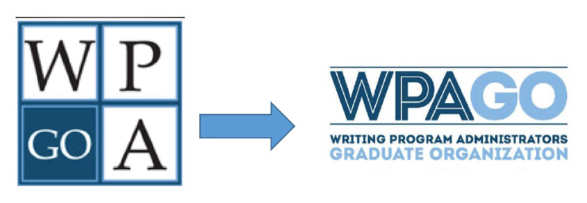
Figure 7. Image representing revisions to the WPA GO logo.
How we make such shifts—when an organization pivots, when a curriculum changes, when new people join a program—is a relatively new undertaking in a field that hasn’t historically fully attended to visuals, hasn’t yet, perhaps, fully realized its capacity to describe, represent, distort, and communicate. Or, quite simply, an organization changes and needs or wants a different visual representation. CCCC did so in 2017, moving from a starburst to a C with partial Cs surrounding it, and, Rita suggests, CWPA might also consider a revision, pointing out that the pristine hand holding a static pen seems at odds with the messiness, diversity, and dynamism at the heart of WPA work.
Some graphics are intended to articulate a concept. That was my intent when I created a Venn diagram representing three curricula I was theorizing: the delivered that institutions represent in catalogue copy, outcomes, assignments, and so on; the experienced that is what students make of our delivered; and the lived, which is what students bring with them to our institutions and what they will graduate into. As a Venn diagram constituted by three circles, the graphic intends to communicate this relationship with a single multiple, as it were. Still, such graphics don’t always report fully. Take, for instance, Anne Beaufort’s graphic of the expertise needed for composing, with its five dimensions—content knowledge, rhetorical knowledge, genre knowledge, writing process knowledge, and discourse community knowledge—which I like quite a bit.
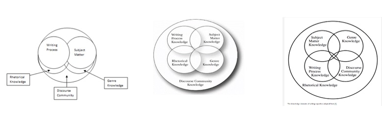
Figure 08. Three versions of Beaufort’s domains of writing knowledge. Will the real Beaufort model please stand up?
It’s provocative on its own in the best sense and telling, I think, in that the one dimension of discourse community knowledge contextualizes the other four—at least in her model, though not necessarily as others report it. They seem to see the dimensions as modular or as components for assemblage. Is such use valuable—that is, an affordance of the model—or does it disguise a misunderstanding of it? A second issue, important for model and visual: the graphic is missing a fundamental dimension, reflection. Or perhaps it’s not a dimension, but as Beaufort details the role of reflection in composing process and expertise, it is at the least a pervasive component of composing that seems to articulate the other knowledges:I opened this response by noting, almost offhandedly, that “visual representations complicate things.” They do, as the observations here indicate, but in so doing, they help us literally see, help us think in new ways, help us identify relationships and map them, help us discern what might be missing or misrepresented or underrepresented. The intent in their use is multifold, and that’s one source of complications: At once, we intend to describe, to represent, to inquire, to communicate, to complement. And sometimes, we succeed, even if contingently, especially when our graphics employ a principle of representative multiplicity, especially when we revisit them, especially when we invite others to help us make sense of and with them.
Visuals have, in other words (and beside them), much to teach us.
Notes
1. This research group included, in addition to Yancey, Robertson, and Taczak, Matthew Davis and Erin Workman.↩
References
Path 3. Visualizing Change
03. Visualizing the Role of Small, Stubborn Facts
05. Diagram as Boundary Object
David Martins
06. Designing to See, Mean, and Act
Laurence José
11. Maps, Stamps, and Plans
Andrew Lucchesi