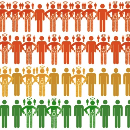
Path 4. Visualizing Program Data
 How WPAs visually (re)present crucial programmatic data can improve the lived experiences of students and instructors. Chapters in this path demonstrate different means of visualizing data and articulate their visual literacy requirements, affordances, and implications.
- 01. "Thinking Through Data Visualization: Leveraging the Exploratory Power of Figures to Create WPA Knowledge," by Julia Voss and Heather Turner
- 02. "Silhouette of DFWI: Census Pictographs as Social Justice Heuristic," by Derek Mueller
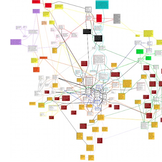
- 09. "Networks of Discourse: Using Network Mapping to Examine the Influence of Institutional Histories and Program Missions in Students’ Writing Development," by Jacob Craig and Chris Warnick
Animating Program Data with Empathy
In his graphic dissertation Unflattening (2015), Nick Sousanis illustrates the stultifying effect that social systems have on the people who live and work within them. Amidst black and white images of the human form, featureless, hunched over, and lined up as if on an assembly line, Sousanis explains that humans suffer from “a flatness of sight, a contraction of possibilities…Here, even choices (of which there are seemingly many), are predefined. Forgotten is the wonder of what might be, in its place, a single chorus…this is how it is” (6–7).
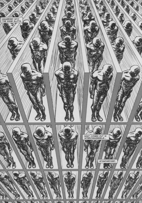
Figure 1. Image from Unflattening. Image source: https://www.researchgate.net/figure/Sousanis-2015-13-Image-excerpted-from-Unflattening-by-Nick-Sousanis-published-in_fig1_282899336.
It’s easy to see our students in Sousanis’ flatlanders (as he calls them), restricted in their thinking about what writing is—or could be—by years spent learning that being a “good” writer or a “good” student, for that matter, is dependent on their ability to learn and follow rules. For many writing professors, we see our classrooms as places where students might break free from those rules. In our classrooms, they can use “I,” they can start a sentence with a conjunction, they can write an essay that has more than five paragraphs, and maybe, just maybe, they can begin to see themselves as writers with something worth saying. And yet, so often, students remain untransformed in our classrooms, constrained from exploring “what might be” by the difficult, flattening complications of their lived experiences.
What’s more difficult for faculty to see is how the roles we play in our own institutions turn us into flatlanders, too, stuck between what we know learning in our classrooms could be and the reality of our experiences. Shrinking budgets, reduced resources, increased responsibility for student retention and persistence—it is relentless—and without any reduction in our teaching, scholarship, or service responsibilities, faculty are flattened by exhaustion.
Sousanis explains that flatlanders “exist as no more than shades, insubstantial, and without agency” (21). For those of us who are program administrators, it might seem we have more agency than others in our institutional contexts, but I think we might be more at risk of being flattened, crushed between the exhausted faculty who need our support and the demands of our deans, provosts, and other academic administrators who need data, schedules, reports, budgets—something … anything … everything—by the end of the day, but sooner if possible. Who has the time or energy to imagine and create what could be when there doesn’t seem to be time to even understand what is?
This is the story I tell myself on bad days, my way of describing and pushing against the flattening forces of the university. On good days, I try to understand “what is” in the writing program I direct and the larger systems in which the program exists; I try to see what is working to help me find solutions for what isn’t. But how do we, as WPAs, know what we know about the programs we direct and the systems in which we labor?
I know what I (think I) know about the writing program based on anecdotal data I collect from what I see in my lived experiences and from the stories I hear from the students and colleagues with whom I interact daily. I know that when I open my email during midterms, nearly a quarter of the unread messages I will see in my inbox will be from instructors needing advice on how to work with a student who has missed so much class they’re failing the course. I know that when I navigate around dozens of students’ outstretched legs in the hallway, it’s the end of the semester and instructors are dealing with panicked students revising their portfolios. I know if I see a message from my chair in my inbox, shortly followed by a knock on my office door, someone is sick and needs help covering their class. I know students are anxious and depressed because I see them write and research about anxiety and depression.
These lived experiences often drive my quest for data to understand the writing program more concretely. I’ll seek out data about student retention, grade distributions, and visits to the counseling center. I know to ask for these data because people will expect me to have it, but I also know it will help me confirm what I already think I know about the program. But what about what I don’t know? How do I know what program stories I’m unable to tell because they exist outside my experience, beyond the stories I hear and tell?
The work offered by Mueller, Craig and Warnick, and Voss and Turner in this section shed light on an expansive, generative way to understand both our lived experiences as WPAs and the data with which we interact in our jobs. In their work, I see a way to breathe life into our stories, to animate ourselves and our work in a way that, importantly, animates those we work for and with—namely, our students.
Each chapter offers meaningful, productive ways WPAs might use data visualization to learn about the programs they direct; as Voss and Turner explain, data visualization is a practice that invites WPAs to think “with and through” data while orienting themselves as “question askers” who have agency in institutional discussions about writing instruction and programs. If we imagine our work with data in this way, spreadsheets turn into research questions rather than reports, and data becomes a way we can learn more about the complexity of WPA work and writing instruction. What these chapters argue for, fundamentally, is a reorientation in the relationship WPAs have with data; rather than “I need to find proof to argue my point,” data becomes a way to figure out what point needs to be made at all. Data as invention and heuristic. Data as beginning, rather than end.
That’s a significant shift, to my mind, in how WPAs might imagine the role and purpose of program data. Because of the flattening institutional pressures that WPAs face in their day-to-day work life, reactive and defensive postures become the norm and data become our protective armor. These chapters offer visual representation of data as an alternative for WPAs who are seeking to understand something deeper about their programs. The authors demonstrate that data visualization has the potential to uncover the innate, complex, and contradictory personhood of the humans who learn and teach in these programs. They offer ways for numbers and lived experience to be represented more fully, precisely because they are represented together.
Perhaps this is most evident in Mueller’s description of his reanimated DFWI data, designed to more fully represent those who are unsuccessful in first-year writing classes, even giving the student a name (albeit one that centers on the student’s performance in the class alone). As Mueller notes, we know some things about Defuie from our spreadsheets, but those cells don’t help us know Defuie or understand why Defuie got “weeded out.” By giving Defuie a human form in his infographic and animating the multiple, intersecting elements of the students’ identities, Mueller’s humane representation of data more effectively illustrates the humans we’re trying so hard to understand. But the uniformity of these shapes is still, despite best attempts, flattening. If I think of the Defuies I’ve worked with this semester, they all resemble those in Mueller’s infographic, but for the Defuie who only attended the first day of my developmental writing class and never showed up again, her empty pockets had a much stronger impact on her attendance than the parents depicted over her shoulder. How do we represent that? How do we represent the student who was assaulted, the student whose parent died, the student on a football scholarship who realized he really hates college and would be much happier in trade school, despite all the pressure he received from his community to stay?
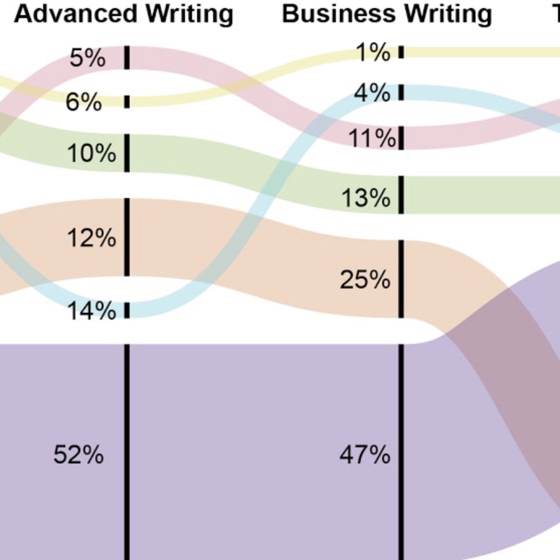
Visualization, no matter our humane intention, is always already reductive. That doesn’t mean we shouldn’t seek to find ways to make our data more humane, but we can’t disregard the limits of the visual when used to represent human experience in all its complexity. In that sense, the networked map that Craig and Warnick offer represents a crucial element that must always remain in writing programs’ inquiry- and data-driven research: the voices of those who labor as students and instructors in the program, the voices of our research subjects. All three chapters in this section acknowledge and are sensitive to the experiences of students and faculty— Mueller wouldn’t think to illustrate the effect that gendersex or socioeconomic factors have on students without knowing their impact on students first-hand; Voss and Turner wouldn’t consider tracing administrative processes through alluvial maps without knowing the considerable labor it takes to get all the students and faculty of a writing program in the right classroom spaces each semester. But Craig and Warnick’s map centralizes student experience visually, linking programmatic functions and features to students’ reported experiences, values, and beliefs, resulting in a visualization of data that identifies gaps and problems in students’ interactions with the program. What would we learn from Mueller’s data if viewers clicked on a data point and heard the voice of Defuie describing the factors that affected their withdrawal? What would we discover if Voss and Turner’s alluvial maps had administrator’s voices woven through the streams? The images would be messier and more complicated, sure. But as Dragga and Voss (2001) explain, “a humanistic ethic would require us to perceive sensitivity and efficacy as at least equally important” as visual design principles and conventions (272). Writing programs are human, and therefore, messy, so it stands to reason that any accurate, honest, and humane visual representation of our programs should reflect that messiness. By incorporating student voices and experiences into our program research and to the representation of the data, we move closer to the humane administration to which we aspire.
My point isn’t to critique the data visualization examples offered in these chapters. Quite the contrary, really, because the arguments and visuals the authors present helped me see my faulty assumptions about how I might use program data, and they made clear what I’ve been missing by passively accepting and circulating flattened data. They illustrate how practices around data in the university flatland can narrow our vision and delimit our potential, and the data visualization they describe invites us to see more broadly. As Sousanis argues, “Armed with multiple ways of seeing, we gain access to multidimensional sight…where existing barriers tumble and creative possibilities flourish” (82). Data visualization offers us an opportunity to resee writing programs and better understand the people who labor in them.
Perhaps what it all comes down to is this: The multidimensional sight these data representations offer is fundamentally rooted in empathy. In these examples, empathy is both justification for and outcome of program data that has been visualized humanely. It’s so easy for data to become disembodied from the people and stories they represent, but our work as WPAs is to empathically understand and give voice to those people and stories who make up our data. As Jamison (2014) explains, empathy “isn’t just remembering to say ‘that must really be hard’—it’s figuring out how to bring difficulty into the light so it can be seen at all. Empathy isn’t just listening, it’s asking the questions whose answers need to be listened to.” We know our lives are hard, and we know our students’ and colleagues’ lives are hard. But by using data visualization to ask questions, shape our research, and present our findings humanely and ethically, we might have a better chance of asking and answering more difficult, and arguably more important, questions about the programs we direct.
References
Path 4. Visualizing Program Data
01. Thinking through Data Visualization
02. Silhouette of DFWI
Derek Mueller