06. Designing to See, Mean, and Act
Giving Shapes To Programmatic Goals
In August 2017, I started my tenure as the inaugural director of a new minor in Digital Studies at a public state university. One of my first tasks was to promote the program among students and faculty members. As a standalone program, the minor is devoid of a physical structure attached to a specific department. It has administrative support located in a suite in the college. However, it does not have a dedicated space with offices for the different faculty members teaching in the program like traditional departments do. It is thus fair to say that, before the beginning of classes in August 2017, its main tangible existence was its presence in the course catalog as a newly approved program and the listing of its classes in the university schedule, along with a program website on the university’s official website.
Building visibility was therefore a key concern. Albeit not limited to a single task—making the program visible involved the organization of open-meetings for faculty across the university, visiting classes, corresponding with students and faculty, pitching the minor at college-level meetings, etc.—this chapter focuses specifically on the epistemic function of visual artifacts for the communication and shaping of the program’s goals. More specifically, it contends that the process of making artifacts like program fliers/cards or promotional banners used during recruitment events has epistemological value and enables us to develop adjustable perspectives to see, outline, and give shape to programmatic goals. In this context, design is considered not as peripheral work but rather as an integral part of the administration and actualization of a program. From a semiotic perspective à la Saussure, this process can be described as designing signifiers (forms) for an academic program so that the signified (its goals and meaning), which only existed as an abstract concept until then, becomes an actualized and recognizable referent (object), or group of referents, on campus. Beyond its role for making a program tangible, visual design is considered here as an impetus and method for shifting perspectives to see new possibilities and generating new meanings. At a more general level, this chapter explores then the relevance and function of visual design work in program administration and what program administrators have to gain by engaging in and with visual documents. Following this stance on visualization as a source of knowledge, this chapter positions itself as, if not an expansion, at least an illustration of the argument made by Sousanis in Unflattening (2015), a book entirely written in comic form. According to Sousanis, “relying on text as the primary means of formulating understanding” leads us to dismiss “what stands outside its linear structure” (p. 59). Building on this call for expanding our perspectives to recognize the importance of visuals in meaning-making processes, this chapter’s goal is to show how moving from the linearity intrinsic to linguistic-based documents, such as program descriptions or program proposals, to the nonlinearity characterizing visual documents, such as banners or fliers, can serve to break out of the (metaphorical) trap as described by Sousanis that an overreliance on words creates.
Launching a Program
Inventing
Before describing the affordances of visual design in program administration, the following gives some context for understanding the site of the present study. In fall 2017, the immediate impetus for making a retractable table-top banner for the new Digital Studies (DS) minor was the necessity to promote and make the program visible. After an almost two-year long conversation and planning period involving faculty from across campus with representatives from departments such as Visual and Media Arts, Communication Studies, Computer Sciences, English, Liberal Studies, Philosophy, or Writing, among others, the program was at a stage where it was reified and inscribed in the official university channels. At the end of winter 2017, the program proposal had made its way successfully through the different curriculum committees, along with official syllabi of records for all the new DS-designated courses. This also coincided with the publication of the “Digital Studies Director” position description. In the university’s context, the minor not only existed but it had been thoroughly explained and justified. Program and course goals had been assessed and approved. Intrinsically and intentionally interdisciplinary, the DS minor is composed of a combination of existing courses from different disciplines (arts, computer science, sociology, liberal studies, marketing, statistics, English, criminal justice, writing, to name a few) as well as brand-new DS-designated courses (such as “Social Media and Culture,” “Digital Data and Design,” “Ethics of Digital Culture,” “Digital Identities and Communities,” “Identity and Representation in Digital Culture,” “Digital literacies,” or “Digital Preservation and Archiving”).
Delivering
As an incoming director, my most immediate task in August 2017 was to support the program’s launch and make its existence tangible and meaningful to the university’s community. Arguably the program’s (soft) launch took place in March–April 2017, i.e., the registration period for the following academic year. This was also when the program’s first visual identity and core message were conceived. At the end of March 2017, the college of interdisciplinary studies, which houses the program, organized a poster-design contest with scholarship prizes. Students were invited to submit a tabloid-size design to give the new minor a look and a message based on the program’s general description. The winning poster, which was selected in April, provided the program with a core message: a tripartite second-person and action-oriented tagline, “Imagine. Explore. Create.” Each action was instantiated by the association between the written form and three icons, a light bulb for think, a globe for explore, and a computer mouse for the idea of creating with digital tools. The poster worked not only as a first marketing and announcement tool but also as the first iteration of the program’s face and voice outside of the university’s internal channels.
Fall 2017 marked the minor’s official start with its first course offerings and the first students declaring the minor. This was also the time for retelling the minor’s story and rationale, a story that had been shared until then mostly among faculty and administrators. The goal was to amplify why the minor existed and how it could complement major programs. While the poster had done some of this preliminary announcement work, much more was needed to give the minor a shape and voice both distinguishable and consistent with the university’s offerings. In this context, the making of (more) university-level promotional materials became an immediate need. From designing the official program description cards and other promotional products (i.e., pens and markers) to developing and curating the minor’s official university webpage, a lot of my time as incoming director was dedicated to reading the original proposal and translating the goals and rationale to different media and for different audiences. Administrating was about deploying and visualizing the program’s goals into different forms to make them meaningful from different vantage points. As a teacher of rhetoric and visual design, I was already convinced of the intimate connection between form and content. If taking an active role in the making of the program’s different material translations was thus a given and easy decision, it nevertheless amplified to me its administrative value. As Sousanis (2015) notes: “Reliance on a solitary vantage point fails to illuminate the whole picture. A fixed viewpoint—a single line of thought can be a trap, where we see only what we are looking for” (p. 36). For a new minor designed to act as a complement to any major, seeking to look beyond one’s own position was not only essential, it was required.
Visualizing
Though visual rhetoric is a recognized area of study, designing promotional materials can be (and often still is) reduced to trivial work, or at least to work that is not deemed intellectual in nature. In an episode of the podcast Design Matters (Millman), design critique and writer Alice Rawsthorn reminds us that “design is routinely described as a styling discipline; […] something that produces snazzy sneakers, overpriced cellphones and is all about appearance rather than substance” (2018). The relegation of design to styling operates on the assumption that content and form are separable, an assumption that Sousanis (2015) so artfully debunks in his work. In this specific case, designing different artifacts for launching the program became for me an exercise in synthesis and meaning-making. For instance, the very act of choosing a typeface for the program’s name and tagline on pens required thinking about ways to shape the text so that it would convey tangibly the alliance between technology and humanities. A serif type was selected to signify the humanistic approach to a technical topic. The serif type works then to enclose and give shape to the digital. The idea of connecting the humanities to the technical and scientific has been a foundational trait of the minor since its inception. Some may say it is its reason for being. The program’s rationale is to ally the learning of digital tools to the development of a critical perspective to gauge their significance and impact within disciplinary and civic contexts. This strategic goal should be discernible, albeit in different ways, across the different referents representing the minor (poster, program descriptions, curriculum documents, etc.). Intentionally choosing a shape to enclose content is one way of showing this.
Similarly, (re)writing and adapting the program’s lengthy description to make it fit onto the university’s double-sided 4.13 x 9.13-inch program-card template demanded a close reading and intentional information selection and design.
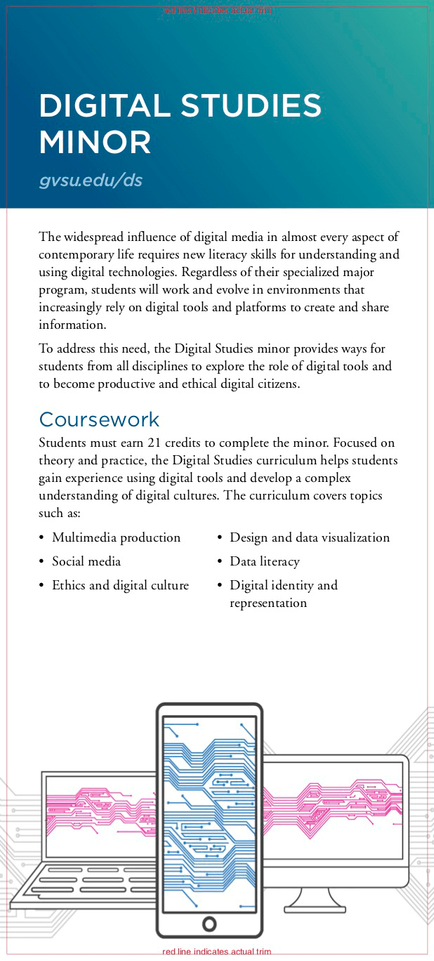
Figure 1. Front page of the 4x9 inch Digital Studies minor program-card/flier.
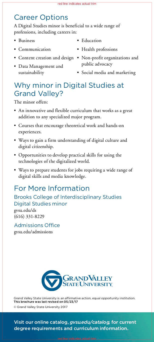
Figure 2. Back page of the 4x9 inch Digital Studies minor program-card/flier.
These cards are displayed on campus and used during orientation/recruitment events as well as advising sessions. The format and size are set by the university’s institutional marketing department; each program gets to choose the content, based on a strict word limit, and to select one visual to include. As I was working on the card at the end of spring 2017—at a time when the program was basically only known in detail by the task force who finalized the proposal and curriculum—I realized how much analysis and synthesizing this exercise required. It was about making the minor’s core philosophy visible. Arguably, the making of this card marked my first engagement with the program’s content at this level. The work that went into choosing a visual and shaping the content (i.e., selecting WHAT parts of the program should be emphasized and HOW they should be emphasized) helped me not only to extract the core meanings of the program but it actually unveiled new perspectives. For instance, the bulleted lists under “Why Minor in Digital Studies” and “Career Options” create a visual relief of specific traits in the program. Given the card’s rhetorical function and physical limitation, the shaping of the content and the selection of a visual came down to deciding how the program should look and sound from a distance so that audiences would feel compelled to take a look at the more detailed message conveyed in the course catalog and curriculum description. While this can be seen as an activity that is primarily promotional and that falls outside of traditional administrative work, it encapsulates the kinds of interpretative work that helps to make sense out of and reveal a program’s goals. It is a way to shift and gain perspective on an object referent to make its contours meaningful to its target audience.
Gaining Perspective
All these design and branding activities participated in making the minor’s programmatic goals knowable and definable. It was about transforming goals and identity into material entities. These processes align well with the way designer and educator Debbie Millman defines branding:
Branding [is] as a process of manufacturing meaning. We create a construct around this thing, then people agree on those attributes, whether it’s something that has to do with efficacy, pain relief, or athletic prowess. Design is the intentional communication of that meaning. Branding allows you to understand what something actually is and design gives you the sense of what it can do. (as cited in Stein, 2017)
Echoing Millman’s perspective, design work became a core step in the administration of the program. It served to actualize it and move it from an insider’s context to the campus community. Retrospectively, these branding efforts were not the first attempts to synthesize and visualize the program. The very representation of the curriculum in the initial proposal can be seen as a scaled zoom out of the program’s fundamental meanings. With a total of 21 credits, the minor requires students to complete two core courses and a capstone, and to choose two courses in two different modules, “tools and production” and “digital culture.” The structure with a common basis (two DS-designed core courses) and modular options (each module contains courses from different disciplines) and a culminating DS capstone reflect the minor’s core principles. That is, a program that emphasizes and connects the “making” and the “critical thinking” with a customizable path in two main modules, which are bookended by two core courses and a capstone. This dual dimension of unity through variety is conveyed on paper by a two-column representation of the two modules with the two core courses and the capstone displayed respectively before and after. Though there is no prescribed order—students do not have to start the minor by taking the core courses—the implicit hierarchy conveyed in the curriculum’s representation on an 8 x 11-inch page renders the minor’s structure and rationale visible. In a way, the official curriculum is the reification of the negotiations between disciplines and departments that led to the creation of the minor: an alliance between STEM-oriented and humanities-oriented disciplines with two major facets, production and critical thinking.
Creating Convergence Spaces
Visual Banner
As shown above, visual work was a core component for administrating the program from the beginning. Yet, it is the making of a table-top banner that really amplified the role of design work for administrating and communicating meaning to and from different perspectives. This banner’s function was noteworthy in specific ways: it targeted outside audiences and needed to communicate the reality of the program while also providing ways for uninitiated audiences to see possibilities for and by themselves. From an administrative perspective, its design became a space for me to physically converge expert and nonexpert perspectives.
The exigency for the banner stems from a university-wide recruitment event held four times a year, twice toward the end of fall semester, and twice toward the end of the winter semester. For this event, high school students and their families visit campus to learn about the opportunities offered by the university. Part of the event is dedicated to an academic information session, which offers parents and prospective students an overview of the different programs while giving them a chance to ask questions to designated academic department representatives. The session takes place in the field house where programs (majors and minors) display their information and materials on tables that are arranged in a large U with open space in the middle. Visitors walk around, stopping at different tables based on their interests and arguably also based on the swag or message put out by the programs. Though promotional objects vary, each program uses some kind of retractable banner. These banners come in two main sizes: one that stands directly on the floor and one, much smaller in size, that is displayed on a table. The banners’ functions are multiple: they create visibility, convey a program’s main message, and act as conversation starter. As a minor, the Digital Studies program used a 15.5 x 31.5-inch table-top retractable banner. The banner was to be displayed next to the other programs (majors and minors) on a set of tables reserved for the college.
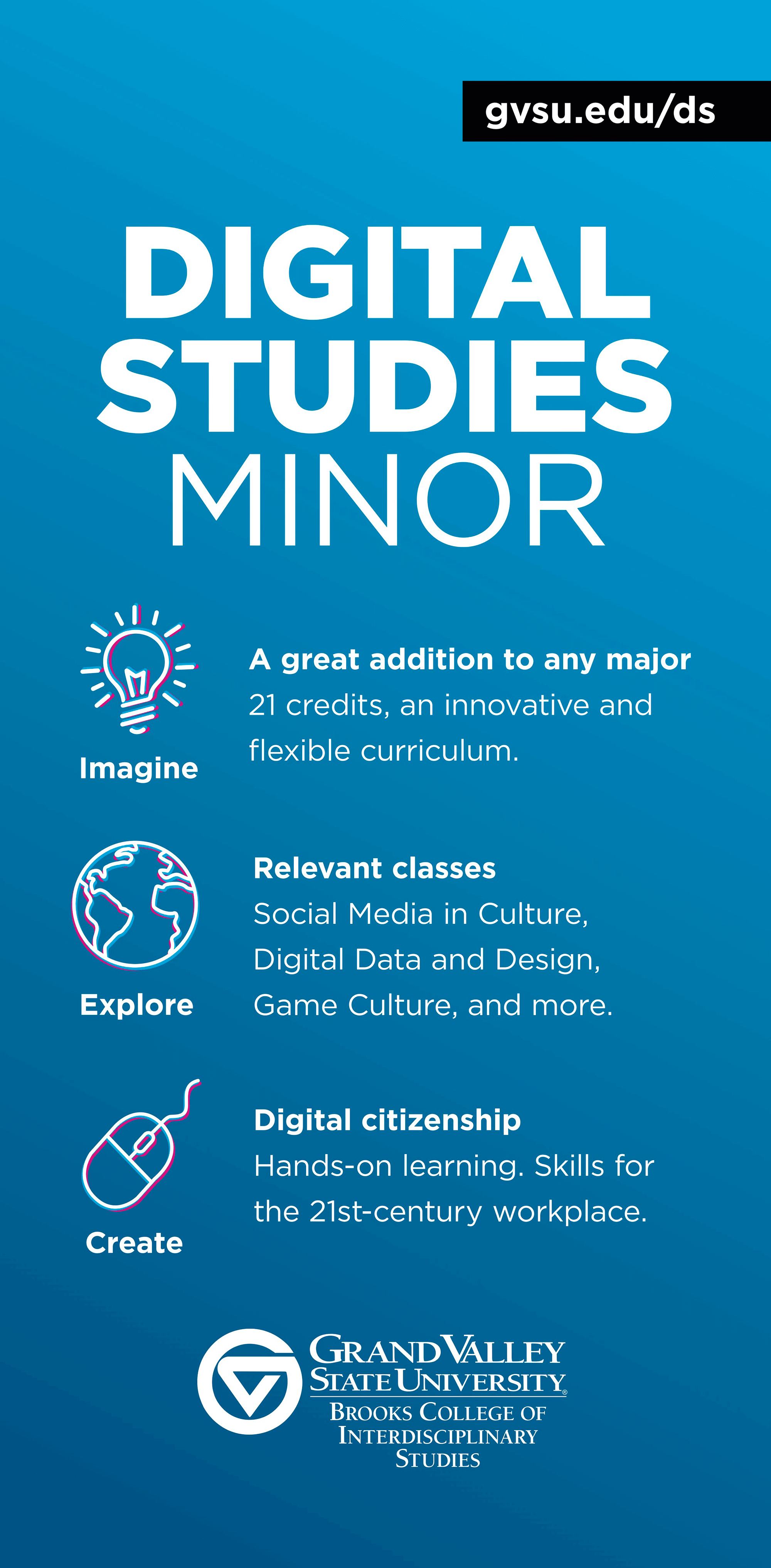
Figure 3. Image of the promotional table-top banner (without the stand) used during promotional events to advertise the Digital Studies Minor.
Template Elements
Though printed and effectively made by the university’s institutional marketing department, the design of the banner’s program elements was the result of a negotiation process between the program director (myself) and a representative of institutional marketing. Typically, programs choose the banner’s model (table-top or full size) and send the copy along with one visual to the institutional marketing department. Given my work with and understanding of design, I chose to draft the document directly in a design software (Adobe InDesign), using the appropriate size requirements prior to my first meeting with institutional marketing. My decision to play an active role in the making of the banner was informed by a resolute attention to intentional design. Having just spent several weeks pitching the program to different audiences and creating visual based artifacts (logo/taglines; programs card), separating content and form for this project was simply not an option. If the common practice is to “send content and, if you have an idea, one visual” and “the team will do the rest,” doing so would have meant effectively embracing a definition of design that makes it, if not merely a matter of aesthetic, at least dissociable from content. Drafting within the design software environment with the required sizes gave me the appropriate distance and angle view for looking at the program, selecting the appropriate shapes to enclose content, and arranging the information on the page.
The one element that I did not use in my initial draft was the exact university-themed background color. The omission was mainly due to a lack of access to the gradient color code. Rhetorically, the background color encloses and contextualizes, inscribing the banner’s individualized and program-specific content into the school’s brand. Similarly, the university’s name and the college’s logo displayed respectively at the top and bottom of the banner connect the content to its location. Along with the physical shape and the typeface, which are all part of the template, the background color, the logo, and the university’s name associate the banner’s content to its main rhetor. Similarity and contrast were thus the main design principles at play (Kimball & Hawkins, 2008). The banner served to individualize and connect. It provided a material shape for the program while also connecting it through similarity to other academic programs in the university. Borrowing from Sousanis’s use of comics, a relevant analogy for describing the template elements’ function is the speech bubble. The design of a speech bubble’s stroke essentially acts as a visual identifier of sounds and of discursive functions (Otsmane-Elhaou, 2016). Similarly, the university-theme elements of the banner assigned a preconstructed face and tone to the program. As a physical object, the template worked thus like the stroke enclosing the program’s message. Just like a speech bubble’s stroke can signify “dream, scream, statement,” the template elements set the tone, the volume, and the communicative function (i.e., a promotional statement). The challenge was to make the program fit within the given frame while preserving its uniqueness. Fitting in while standing out was my given task. This required engaging in close reading (of the program’s intricacies) and distant reading (to see the program’s distinguishing qualities). It was about zooming in to be able to zoom out and maintain a high-quality snapshot. Design was then about determining the appropriate level of detail given the banner’s material limitations and its target context.
The Customized Elements
The banner’s customized elements, that is the ones that were not given by institutional marketing, were the copy text and the three icons. These elements are an intrinsic part of the program’s identity and are present in different forms in different documents (curriculum, website, etc.). The icons and their corresponding verbs work here as a means to connect the original launch poster to the program’s curricular goals. In order to deploy these elements on the banner draft shared with institutional marketing, I recreated vector shape versions of the icons in Adobe Illustrator. I also arranged the elements on the page to create specific associations between the program’s curricular content and what it affords users to do (i.e., imagine/explore/create).
Specifically, the customized elements operate on two main levels: first, through symmetry between columns, they establish connections between the program’s significance from a student perspective (left column) and the program’s actual components (right column). That is, they amplify the actions students would undertake and connect them to specific curricular elements. Second, they convey a visual hierarchy to signify time and progression (top-down movement imposed by each column). Hence, the elements on the left—verbs in command voice with their respective visual representation in vector shapes—directly engage the audience and amplify what “they will do” in the program while the elements on the right—the references to what the program is (a complement to any major), contains (timely/new classes), and does (development of digital citizenship)—act more like a synthesis of the program’s curriculum. Another way of reading this arrangement is to say that the structuration of the elements works to call on the audience and encourage them to see themselves in the program and beyond. It is about the immediate and distant future. In this regard, the banner operates differently from most of the banners at the recruiting event. Traditionally, banners follow a title-content-visual (one image) organization, which suggests that the making of the banner is most often the result of a strict division between the generation of content (the WHAT) and the design (the HOW). In this case however, the design was intentionally negotiated to maximize its effects and function given the rhetorical situation at hand. Recruitment being about different degrees of distant future, it was essential for the banner to encapsulate both the present, i.e., the minor’s main elements (the classes and what they mean), and the future (the program’s professional and social significance, given students’ post-graduation plans). The top-down and left-right movement created by the columns worked then as a reading path for guiding conversations and keeping the focus on the program’s main action-oriented goals, i.e., to learn new tools and develop an understanding of what the tools do and mean. In other words, the banner served as an interface between the program’s detailed elements and the user’s main needs. Retrospectively, the process that I used parallels the distant reading techniques as described by Mueller (2017):
Distant reading intentionally varies the level of detail at which readers ordinarily engage with texts. It begins with the collection and selection of text-based data (e.g., words and phrases, citations, time stamps, and geolocations), which are then remade, often with the assistance of computational processes, into abstract visual models. (p. 28)
In the case of the banner, the program’s various descriptions (website copy-text and other curricular documents) became sources for collecting words, phrases, and ideas to derive and give shape to the most salient and essential elements of the program. This design work was as thus an exercise in abstraction performed and rendered through the lens of a design software.
While having access to and knowledge of the Adobe Creative Cloud programs can facilitate this abstraction process—Adobe Illustrator and InDesign provide a plethora of options for shaping and customizing meanings—the goal here is not to say that program administration demands fluency in advanced design software. Most of the tasks described above could be performed with more entry-level design tools, though it would mean giving up some agency and accepting to operate within predetermined frames and shapes (i.e., template elements). Even with this limitation, the very act of designing enables us to shape a program’s outlines so that it becomes meaningful to different audiences and from different perspectives. Moving administrative work outside of a linear word processor can, in this regard, encourage us to see beyond a page and unfurl meanings. Consequently, it affords us with opportunities to amplify the intellectual work performed by program administrators while, simultaneously, prompting us to expand our own conception of what meaning-making processes involve.
Conclusion
While more could be said about the banner, the key lesson here is that the work associated with its design served as a method for making the program understandable and usable. The banner itself is the result of a combination of close and distant reading and provides a scaled snapshot of the program. It creates common ground for engaging in discussions between prospective users (students, parents) and experts (administrators, teachers). Design is inherently administrative labor.
Recognizing visual design as administrative work compels us to see (effective) program administration as moving intentionally and seamlessly from a program’s back end (i.e., proposals, syllabi, etc.) to the front end (posters, flyers, advising sheets, etc.). While this does not suggest that all program administrators should be experts in visual design (or, maybe it does?), it asks us, however, to adopt a more comprehensive and inclusive perspective on our definition of what counts as administrative work. Visualizing creates and connects meanings. It gives shape to ideas. It makes them recognizable. It is about, to borrow Sousanis’s phrase, “reaching in, while drawing out” (2015, p. 137). Differently put, we must accept to shift perspectives and alternate our expert-conditioned reflexes to read (too) closely with intentional efforts to step back and reach outside. At a time when traditional programs are challenged and asked to demonstrate their relevance in outside contexts, accepting to put on this visual lens also holds the promise of enabling us to create scalable perspectives on our work so that it can be shared and seen by outside audiences in a more inclusive way.