Path 2. Visualizing Complexity and Simplicity
 WPAs often turn to visualization as a generative means of showing great program complexity and of introducing inventive simplicity. Chapters in this path illustrate issues of legibility and uptake when WPAs visualize complexity, attempt simplicity, or toggle between the two.
- 01. "Thinking through Data Visualization: Leveraging the Exploratory Power of Figures to Create WPA Knowledge," by Julia Voss and Heather Turner
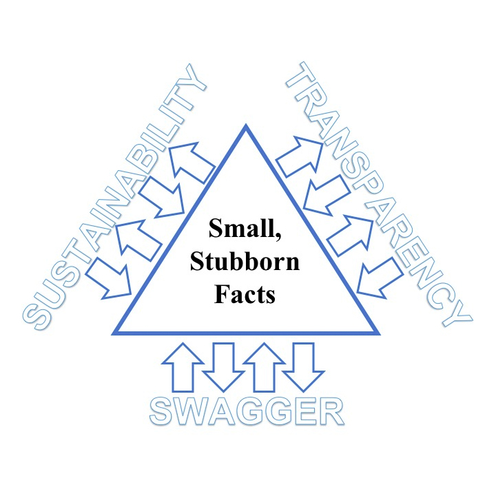
- 03. "Visualizing the Role of Small, Stubborn Facts: Changing Stories of Writers and Writing," by Ryan J. Dippre
- 07. "Is Teaching Just a List? Toward Feminist-Humanistic Visual Representations of Being a Writing Teacher," by Rachel Gramer
- 08. "An Ecological Heuristic for Programmatic Curricular Revision and Transformation," by Natalie Szymanski
- 09. "Networks of Discourse: Using Network Mapping to Examine the Influence of Institutional Histories and Program Missions on Students’ Writing Development," by Jacob W. Craig and Chris Warnick
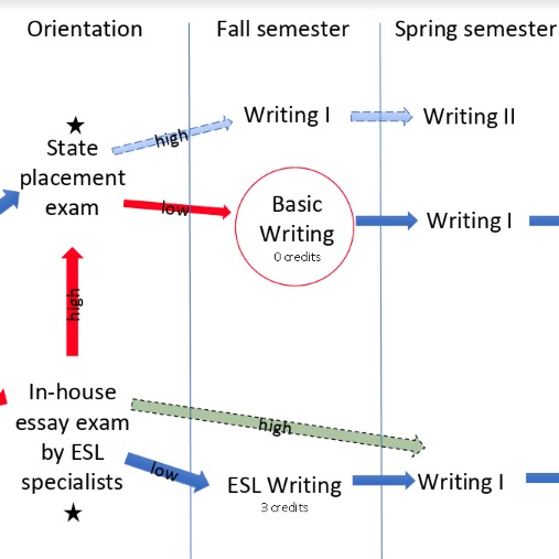
- 10. "Visualizing Fairness: A Critique and Revision of Placement Practices for International ESL Students," by Jamie White-Farnham
Response to "Visualizing Complexity and Simplicity" in Radiant Figures
The last time it happened was in one of those introduction-to-the-discipline seminars that department chair and good friend Carolyn Rude and I were co-teaching. I had fielded the comment (or was it a question?) any number of times before—after conference presentations, in response to reviewers’ notes, even at department social gatherings—so I shouldn’t have been surprised. Somehow, this time it bothered me, and something (frustration? disappointment? anger?) must have shown on my face because I heard the student saying she didn’t mean to be disrespectful, but....
I am sorry anything other than interest showed on my face, actually, because Heidi Lawrence should never have had to apologize or worry. She was a wonderfully bright new PhD student, someone who has now gone on to be an accomplished associate professor, fine scholar, and award-winning teacher at a major university. Perhaps that is why the comment (or was it a lament?) saddened me.
Carolyn and I were co-teaching the seminar, so the two of us divided the work of each week into our respective strengths. That meant questions on issues in technical and professional communication typically went to Carolyn while questions on composition, rhetoric, and visual literacy most often came my way. On that evening, I had just presented to the class some of the work I had done on visual rhetoric that they were likely to come across as they continued their doctoral work. It might have been my journal article–length history of how visual literacy has been handled in the teaching of composition over the years, and so it wasn’t anything revolutionary or at all shocking. When I finished and opened the floor for discussion, Heidi simply said, “It troubles me. I love words, and I feel we are losing our love of words with so much focus on visual literacy.” Now, I suspect I have not remembered her words verbatim, but that was the gist.
I tell that little story only to get to a parallel story in which my response was nearly the same as Heidi’s. Now wearing her department chair hat, Carolyn asked me into her office one afternoon and handed me my 50+ page report on the composition program and the writing center. At the time, I directed both and was responsible for both budgets. While the composition program was doing well, the writing center was in bad shape. I needed a serious budget for the center, one that would help train and hire tutors (at both undergraduate and graduate levels), fund an outside reviewer, find a truly useful space, fund conference attendance, and more. I wanted the department, the dean, and the university to know just how much this center did with almost nothing. I wanted department chairs across campus to know how much and how well we served their majors at every level during their stay at Virginia Tech. I needed to get the word out.
Carolyn put the report between us and said, “This is really great, but they’ll never read it.” I was about to argue that I would definitely shorten it up and provide a quick summary at the beginning when she said, “You need visuals that really pop. Something that tells the story so well that they don’t need to read it.”
I must have looked a lot like Heidi at that moment. I was shocked and just a bit angry. To be fair, Carolyn was not saying the others didn’t care enough to read my report. What she was saying was that they had dozens of these to look at and make judgments on. They didn’t have time to go through them all as carefully as each deserved. They needed a way of seeing what the argument was, and that had to come before any lengthy detailing.
Still, I had spent days on that report painstakingly detailing absolutely everything the center did and every cent the center spent. What visual in the world would “pop” enough to tell all of that to make my argument as plain and as compelling as I knew it had to be? To do that I had to turn to someone who I knew could make a much better visual argument with data than I could. I turned to another PhD student. Tim Lockridge came to the rescue.
Tim did exactly what the authors in this collection of articles did. He came up with visual ways of making the argument I had been trying to make for 50 pages for at least four years with very little success. His visuals were simple but, as Carolyn had requested, they were compelling.
Moreover, while some of the authors in this section of the text might consider them a bit too straightforward, they did the work. Department chairs, deans, and provosts actually started paying attention to the writing center. Within the next few years, deans were beginning to ask if they could borrow my visuals to make their own arguments about why the center needed support from the entire campus. In other words, these simple but telling visuals did precisely the work they needed to do. Today’s Virginia Tech Writing Center is successful for any number of good reasons—the current leadership of Jennifer Lawrence is one of those reasons. But, it could never have been successful if the campus had never funded it, and that funding came only after I learned the importance of visualizing quantitative data.
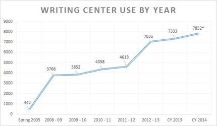
Figure 1. Writing Center Use by Year. A line graph plots and increase in consultation appointments in the Virginia Tech Writing Center.
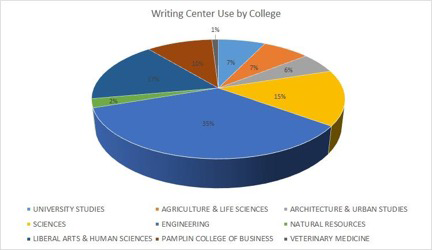
Figure 2. Writing Center Use by College. A three-dimensional pie chart shows the distribution of writing center consultation appointments by college.
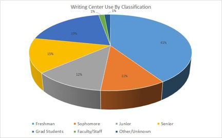
Figure 3. Writing Center Use by Classification. A three-dimensional pie chart shows the distribution of writing center consultation appointments by classification.
In the end, of course, these visuals are all about seeing connections. They tell the story of a growing center and of a center that serves the entire community. Some department chairs asked why the center doesn’t charge for services. Some asked if the center would consider testing their majors. Those of us who know and work in writing centers know that a good writing center should be free to anyone who wants or needs it. Most of us resist testing because that isn’t the role of a writing center. What none of the chairs or deans could do was ignore the visuals we had shared
Visualizing Complexity
We have known of the importance of visual representations of complexity for a very long time. Guardian journalist Simon Rogers (2013) called John Snow’s 19th-century scatterplot map of London’s 1854 cholera outbreak, a map that changed the world and (more to his point) became a standard for data journalism from that time to this. That visual is now a classic starting point for anyone trying to explain the value of visualizing data.
Closer to home think, for example, of the now commonplace “purple states” maps that allow readers to stop seeing the nation in terms of red (Republican) vs. blue (Democrat) territories but, instead, a nuanced combination of both out of which eventually one or another party is named the winner. Today, it is a simple process to go to the digital edition of any good newspaper, even as traditional a paper as the New York Times and find interactive graphics that will show you red, blue, and purple states, or with a touch, red, blue, and purple counties, cities, towns, townships, and villages. In other words, data journalism depends on the kinds of visuals begun with John Snow and his map of a single cholera epidemic clustered at a single public water pump.
English departments are slow to come to visual rhetoric. Perhaps like Heidi (or me in my meeting with Carolyn), they worry that a love of visuals somehow erodes our love of words. Of course, this isn’t an either-or proposition (either words or images). We know that, but somehow the tug of the visual is often felt as a kind of disloyalty to the word.
What the authors of this section ask of us, then, is not at all easy. They ask us to try to depict visually the worlds of teachers, students, and administrators, because as much as we might like to think of our jobs somehow resting outside of the drudgery of institutional politics, the fact is that we rely on those institutions to value us, to understand our work, and ultimately, to fund us. It might not be all that pleasant to think that we are always talking to the upper administration, but most WPAs are doing just that because they must.
That is the story the authors in this section offer—a story of how to see what we know is true about our work. Dippre’s search for a way to visualize the small, stubborn facts of students who write—a way to visually give the lie to the old “students can’t write” myth—is a part of that story. Rachel Gramer asks how we might visually represent the activity of teaching writing. How do we show others what is crucial about this work of ours? I’m not sure I have a good answer for that, but I do know that the most important thing we must do as we visually represent our work is to somehow communicate how what we do interacts with the lives and work of others.
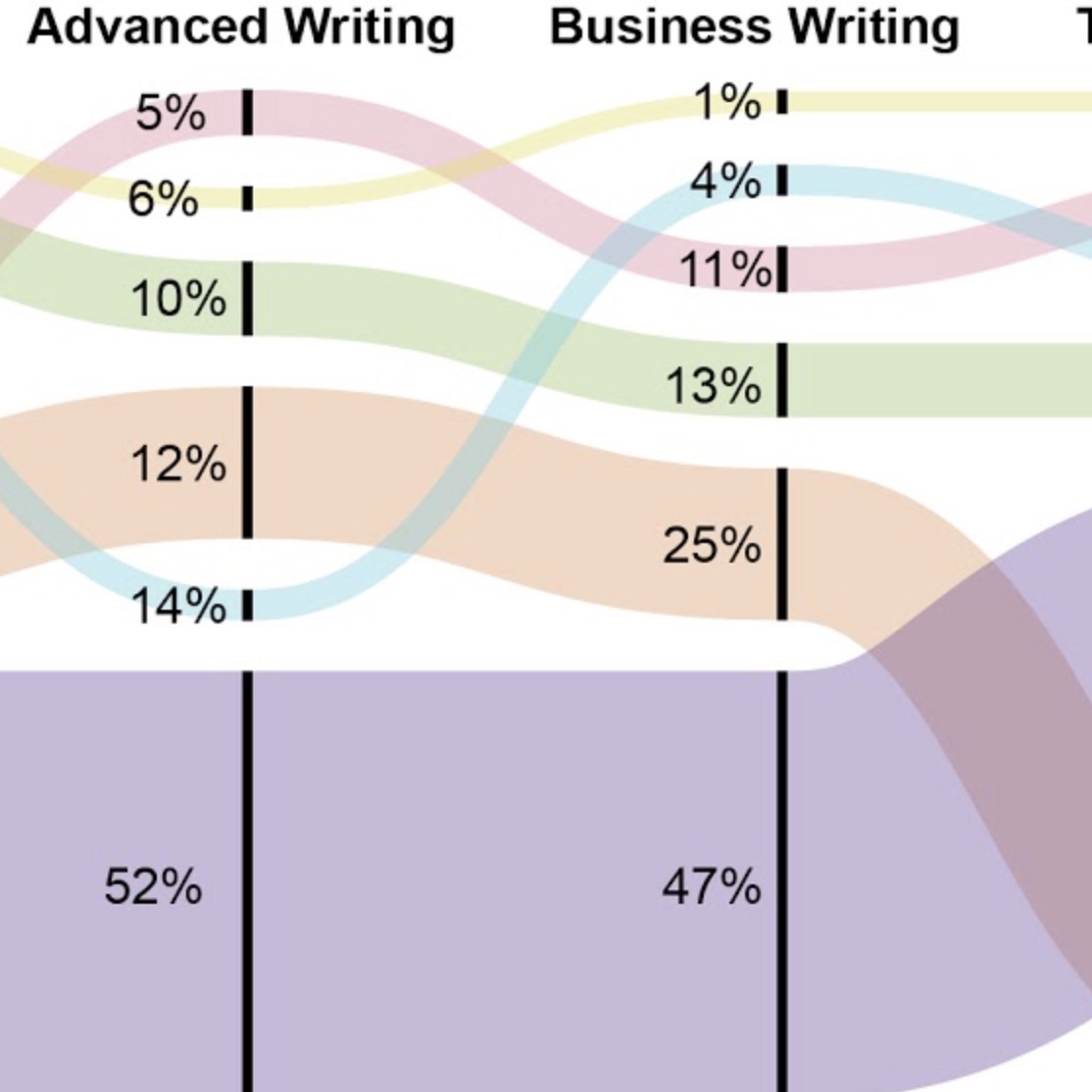
Charts, diagrams, maps and such may seem like very simple, even simplistic tellings, but they are far from either. Moreover, they do not propose a choice between words and visuals. They are a language that must be easily read at the same time that they communicate legitimate intricacies. Like Voss and Turner’s alluvial diagrams, such visuals offer a way of seeing complexity and understanding growth, change, and institutional relationships.
When I think of the value of visual literacy, I often find myself going back to those old 19th-century maps of Africa that depict the center of that continent as absolutely blank or (at worst) totally black—maps of what came to be called Darkest Africa or The Dark Continent. We know now, of course, that mapmakers knew much more about those blank or dark sections of the continent than their maps dared show. What those maps proposed was that here was a land that needed explorers, most of whom ultimately became exploiters. Unlike Snow’s scatterplot map that sought to uncover a truth, those old African continent maps sought to cover truth. They invited exploitation. They ignored people and cultures and communities to sell the ideas of adventure and profit.
The maps, diagrams, charts, trees, and timelines we offer on behalf of writing programs need to be more John Snow (Rogers, 2013) and less Henry Stanley (Rogers, 2012). They need to uncover truths and offer possibilities. That is the challenge the authors here place before us.
References
Path 2. Visualizing Complexity and Simplicity
01. Thinking through Data Visualization
03. Visualizing the Role of Small, Stubborn Facts
Ryan J. Dippre
07. Is Teaching Just a List?
Rachel Gramer
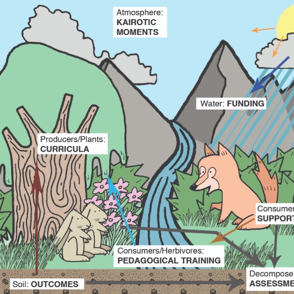
08. An Ecological Heuristic
Natalie Szymanski
09. Networks of Discourse
Jacob W. Craig and Chris Warnick