02. Silhouette of DFWI
Census Pictographs as Social Justice Heuristic
On a new semester’s first day, a graduate teaching associate in a large first-year writing program stands before a class of 25 students, next circulates a syllabus, or leads attendees through an icebreaker activity (a name table-tent note card with identifying icon and three beliefs about writing, a What’s on your mind? map, or a handout inquiring about attitude and disposition, maybe). It’s not difficult to imagine, is it? The GTA calls a list of names, learning at the crosshatch between name and face, listening for and noting re-pronunciations, alphabetical order as was generated by the university’s enrollment management system. Here is a list of made-up names meant to aid immersion into the hypothetical roll call.
Adrian Bo
Damianna Florida-May
Carin Ford
Rena Frownbrow
Dondon Kavanaugh
Phillip King
Magenta Monochrome
...
Leonie Reilly
Quality Smiles
Haggerty Xilch
Defuie Zimmer
“Defuie? Is Defuie here today?” And so it is on the first day of the new semester, Defuie, it just so happens, does not show up to class. The GTA notes the absence, later double-checking the class roster to determine whether the roll data is current and accurate. The reliability of roll data is, for instructional staff of all ranks, a commonplace example of what I call institutional data felicity, a condition of accord bridging computationally ready-made data sets and sites of teaching and learning. In the banal instance of attendance rolls, institutional data felicity aligns expectations, ensuring the people and places and designated purposes match up, therefore organizing on-campus activity (e.g., enrollment) into reasonably stable patterns. Data felicity makes the organization work. Into this attendance-taking scenario, however, Defuie’s absence introduces a complication, illustrating an obverse condition that comes about when institutional data does not corroborate who shows up. The complication asks but does not answer where Defuie is, while mirroring institutional data felicity with its slippery counterpart, institutional data infelicity, or the possibility that the list, even in its exceedingly shallow depth of detail, is erroneous. Sometimes under the auspices of historically glitch-prone enrollment management systems and other times justified by elaborate cybersecurity protocols, universities don’t make it easy for instructors to know a whole lot about students from the start. With transactional data felicity, classrooms and lists match, and all is well at this extraordinarily basic function of organizing institutional activity. With data infelicity, however, comes complications and questions—a few of which I believe are germane to the premise of improving accessible, equitable, and just higher education for all, particularly at public, land-grant colleges and universities—a concern at the heart of this chapter. In this opening scenario it is early in the semester, and we do not as of yet know where Defuie Zimmer is, who Defuie Zimmer is, or why Defuie Zimmer missed the first day of class.
From this common scenario, the following chapter explores the generative relationship between visual rhetorics and everyday writing program administrative contexts by illustrating how infographics can animate DFWI rates in large-scale first-year writing programs. DFWI rates identify the percentage of students in any class, course, program, or academic department who at the end of the semester finish with a D, an F, a (W)ithdraw, or an (I)ncomplete on their academic record. Rates can be calculated from a grade report collected in aggregate at any scale, from the single class to every class at a college or university, even every class in a university system (though this data is not readily available nor publicly accessible). For example, if, in a class of 25 students, eight earned As, nine Bs, three Cs, two Ds, one F, an incomplete, and a withdrawal, the number of students in the DFWI would be five, and the DFWI rate for the class would be five out of 25, or 20% (Most universities are not really working with this data, making it available to instructors, or undertaking the work of changing curricula in ways that would redraw entrenched patterns where DFWI rates and identities coincide.) Defuie Zimmer, then, is a moniker chosen to personify and humanize this underexamined phenomenon. "Defuie" offers an adapted pronunciation of the acronym DFWI; it is meant to lend depth and dimension at that juncture between people and data.
The goal of this chapter is to articulate the generative potential of infographics for helping writing program administrators and other university stakeholders notice, engage with, and advocate for DFWI students—toward more ethical, equitable, and just curricula. The chapter continues first by revisiting Sam Dragga and Dan Voss’s groundbreaking visual rhetorics article, “Cruel Pies: The Inhumanity of Technical Illustrations,” to reframe what is even crueler about under-acknowledged spreadsheet cells, such as those that report the number of DFWI students in a course, a department, or an entire general education program. From there, the chapter argues for approaches to infographics that reconstitute DFWI from ordinary tables, striving to animate more conspicuously identifications of students in the DFWI range, specifically in terms of sex, race and ethnicity, socioeconomic status, and first-generation status. These four identifications are by no means exhaustive. There are additional identifiers, such as disability, age, religion, language, and others, that also must be acknowledged as having bearing on retention and persistence in academic programs. Although these additional identifiers are not a part of the Gardner Institute analytics model that influenced this chapter, writing program administrators should routinely look at the grade distributions across designated identities, where institutional data allows, for the ways they may yield insights about areas of the curriculum overdue for revision. Ultimately, I hope for this work to generate greater discussion of all facets of DFWI identities and also for this project to be build-on-able, for its extensions to manifest as concern for identity designations beyond the four I’ve addressed. Implicit in the account is a story about institutional data felicity turned infelicitous as well as a call for carrying out yet further efforts to enlist infographics as suasive visual rhetorics toward more ethical, equitable, and just academic programs.
As the introduction to this volume establishes, if the so-called “pictorial turn” identified by W.J.T. Mitchell found media hold in the second half of the 20th century, it did not quite reach the disciplinary specialization of writing program administration in any discernible or traceable way. WPAs were beginning to circulate gradually more formal scholarship with the WPA journal’s transition from newsletter to academic journal in the mid-1980s, but visual communication in the domain of administration is, even to this day, fairly spare, only in recent years beginning to gain hold as what other contributors to this collection have described as VizAdmin, or graphical operations in everyday administrative contexts
Design thinking, both practically and experimentally applied and with an emphasis on visuality, did surface, circulate, and take hold in the late 1990s and early 2000s, particularly in contexts of rhetorical theory, writing pedagogy, and technical communication ethics. For instance, Diana George’s 2002 College Composition and Communication article “From Analysis to Design: Visual Communication in the Teaching of Writing” is particularly representative of the field’s heeding a visual turn. George argues for a shift beyond the analytical processes of noticing deeply the subtleties and effects in the work of others (e.g., in commonplace assignments that sponsor advertising analysis) and toward pedagogies in which students are designers, themselves making visual artifacts. Setting out from a place of pedagogical dissatisfaction, George states, “Our students have a much richer imagination for what we might accomplish with the visual than our journals have yet to address” (12). I find it striking, nearly 20 years later, that we can hazard a parallel assertion true today: although visual rhetorics, such as infographics, data visualizations, and simple models operate formidably across disciplines and even within some first-year writing curricula, where multimodality is explicitly sponsored, and although writing program administrators may be employing a wide variety of visual communication strategies, artifacts and examples of this work tend to circulate only locally and infrequently appear in published scholarship.
While tracing neat causality is a fraught pursuit, the early 2000s also delivered warranted hedging and caution about the deluge of infographics rising in circulation. Just a year before George’s positive argument for design in teaching contexts, Sam Dragga and Dan Voss published “Cruel Pies: The Inhumanity of Technical Illustrations,” which contextualized a visual turn paired with the perilous ethics involved with famous graphical representations, such as Charles Joseph Minard’s diagram of Napoleon’s invasion of Russia, a diagram celebrated by Edward Tufte for its “conciseness and efficiency” (266). With humanistic ethics as their primary filter and sustaining goal, Dragga and Voss assert that the invasion infographic “isn’t so much deceptive, however, as it is plainly inhumane—insensitive or indifferent to the human condition it depicts” (266).
Many technical illustrations of the moment tolerate and even implicitly compound this indifference, privileging statistical redundancy over the visible, explicit depiction of human emotion and embodiment. Cruel pies are cruel, then as now. And, in the hands of one with no humanistic or visual rhetorical education, cruel pies are easy to make. Uncritical graphics too readily sponsor harmful, bumbling shift-outs from quantitative data to visual form. Absent acute visual-rhetorical awareness of human subjectivity, not to mention graphic tools built into every mass market spreadsheet application, automation, expediency, and uncritical interfaces favor the practice of cruel pie–making. Nevertheless, Dragga and Voss offer constructive solutions and optimistic reframing of the inhumanity of technical illustration, particularly when they suggest the addition of humanistic pictographs. It’s not clear whether Dragga and Voss’s cautionary warnings stunted visual rhetorical experimentation in the early 2000s, yet their call for bringing humanity “to the creation of visual communication” (272) warrants honoring, as it lends context to the attempt that follows—that of visualizing a writing program’s DFWI rates as humanistically as possible and thereby to provide a heuristic for a more ethical, equitable, and just curriculum.
At their crudest or most straightforward, the DFWI rates I’ve seen circulate appear in tables. I would hesitate to assert that in 2020 it is widespread practice for first-year writing programs to calculate, much less to publicly circulate, DFWI rates. There are not, insofar as I can find, any shared or otherwise cosponsored models from professional organizations in rhetoric and composition/writing studies that provide guidance on how or why to calculate DFWI rates, nor much in the way of what we can learn from them. Nor are there recommendations about the promises or pitfalls in inter-program benchmarking or about the possible value in publishing DFWI rates publicly. Due to changing jobs in 2018, moving from one university to another, I had the unusual opportunity of calculating DFWI rates in one first-year writing program and then in another. This offers an admittedly modest study in contrasts, but it is useful for putting a finer point on the heuristic potential of DFWI rates in contexts of writing program administration, which I will, in what follows, carry over into challenges with representing DFWI rates visually, with the goal of their aiding us in leading more just and equitable writing programs. Across these two programs, the curricula are reasonably comparable, with a Comp I course premised upon a foundational orientation to rhetoric and its interdependency with reading and writing practices, and a Comp 2 course designed to guide students in writing from research, gaining fluency with a methods vocabulary, and developing research projects oriented to primary research while also working with published sources. Both DFWI tables reflect aggregate grade information from fall 2013 through spring/winter 2018 (five years).
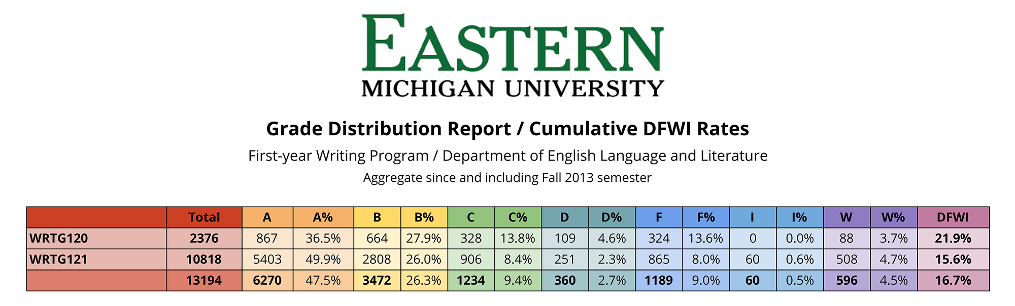
Table 1. This table presents aggregate grade information over five years from sections of first-year writing at Eastern Michigan University. Out of the 13,194 students tabulated, 16.7%, or 2,205 students were assigned a D, an F, a W, or an I.
At Eastern Michigan University, first-year writing classes are taught by graduate assistants, full- and part-time lecturers, and tenure-track faculty. Sections are capped at 25 students. Many students bypass Comp 1 and go directly into Comp 2. And EMU is what we commonly refer to as an opportunity granting, or access-oriented university—a regional comprehensive that was recently classified as Research 2. Eastern Michigan University doesn’t make readily available data on its most recent incoming class in terms of applications, offers of admission, and acceptances of admission. Table 1 shows that over a five-year period, 73.8% of students earned As or Bs in first-year writing, and 16.7% ended the semester with a D, an F, a W, or an I. That’s 2,205 students in five years.
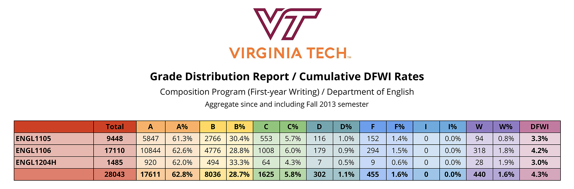
Table 2. This table presents aggregate grade information over five years from sections of first-year writing at Virginia Tech. Out of the 28,043 students tabulated, 4.3%, or 1,206 students were assigned a D, an F, or a W.
At Virginia Tech, first-year writing classes are taught almost entirely by full-time instructors and graduate teaching assistants (MA, MFA, and PhD). The placement process at Virginia Tech (advanced standing) ensures that many students enroll in Comp 1 and Comp 2 in their first year. Classes are capped at 20 students. Virginia Tech is a research-intensive land-grant university with a distinct emphasis on sciences, technology, engineering, and mathematics. A recent representative class of first-years, the Class of 2023, saw 32,103 applicants, 19,963 offers of admission, and 6,428 admission acceptances (Undergraduate Admissions, 2019). Table 2 shows that over a five-year period, 91.5% of students earned As or Bs in first-year writing, and 4.3% ended the semester with a D, an F, a W, or an I. Converting from percentages to people, that’s 1,206 students in five years.1
Reading these tables, I urge an approach to the data that cautiously, carefully recognizes the complexity embedded in them; all that they do not and cannot tell us matters as much as what little they confirm. That is, we cannot know by glancing at them just how impactful intersecting factors, such as instructor experience, curricular stability, class size, academic preparation, recency of experience with writing, approaches to evaluation, and more are.
The tables do, however, heighten awareness of patterns relevant for writing program administrators and for other stakeholders, as well. These first-year writing programs do not appear to sponsor what, just the other day during an appointment in my office, an undergraduate student described as “weed-out” classes. When any vocabulary of weed-out classes circulates on our campus, it should give us pause—at least long enough to question the aims of public higher education at land-grant universities. And although these tables don’t reflect the disconcertingly high DFWI rates at or above 40%, it remains our responsibility to inquire—to really inquire—into what is happening with the 2,205 students in Table 1 or the 1,206 students in Table 2 who did not end the semester with gainful standing. To raise this question—what’s happening?—at greater volume is to recognize first the critical shadow of cruel pies. The table is not a pie; it is comparable to a cruel sheet cake. And—pie or not—its form is nevertheless complicit in an obscured subjectivity that matters. What, then, is the data-visual technique that will aid us in animating the spreadsheet cell in the lower right? By what configuration of iconography or pictographs can we get to know Defuie better?
Together, let’s see—by building a radiant figure—a little silhouette of Defuie. We know that in both of these first-year writing programs, a vast majority of students are not weeded out but gaining roothold. Focusing our inquiry on the blended vagaries of Defuie, generally, the method I have applied bears faint resemblance to the facial averaging phenomenon from 2013 and since then, whereby visualization software converts a set of facial images into a single image, rendering a polymorphous aggregate. I am not suggesting this fuzzy patterning work as anything more than a heuristic to gain perspective on who, exactly, is not faring well in our courses, so that we can inquire at a broader scale into why.
Taking Dragga and Voss’s suggestion seriously, I’ve assembled a series of census pictographs, each with 100 generic humanoid forms, perhaps already cruel for their feature and shape normativity. Abstraction always strains against lives real and lived. Let’s imagine they are students enrolled in first-year writing. The first series, for Virginia Tech (Figure 1), shows five sections of writing classes capped at 20. Sixty percent of the students are finishing with As. The next 30% of students are finishing with Bs. Cs go to almost but not quite 6% of students. And this leaves only a narrow margin for DFWI. In Blacksburg, VA, in Composition, the DFWI rate between 2013–2018 was only slightly more than 4%.
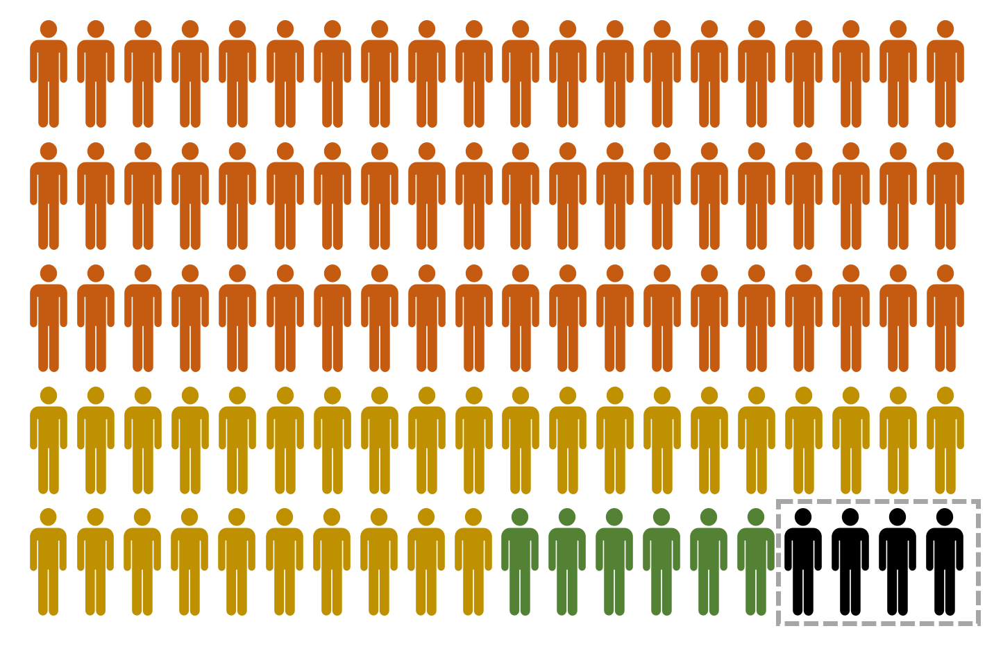
Figure 1. Census pictograph based on grade distribution data from Virginia Tech’s Composition Program.
Even so, we must not make too little of this. When I shared this data at a recent program-wide Teaching Talk, I stood before the room and asked, about these 1,197 students who have finished with a D, an F, a W, or an I in the past five years, what is our shared responsibility to notice them, to really notice them? What might we learn if we cupped an ear to Defuie and really listened? Or if we invited Defuie to a focus group to begin to gauge just what, exactly, is happening? We must not assume about Defuie that doing poorly is about academic underpreparation alone.
The silhouette of Defuie is not quite the same for EMU. Out of 100 students, or four sections, it’s more like 47 As, 26 Bs, and 9 Cs, which leaves 18 students.
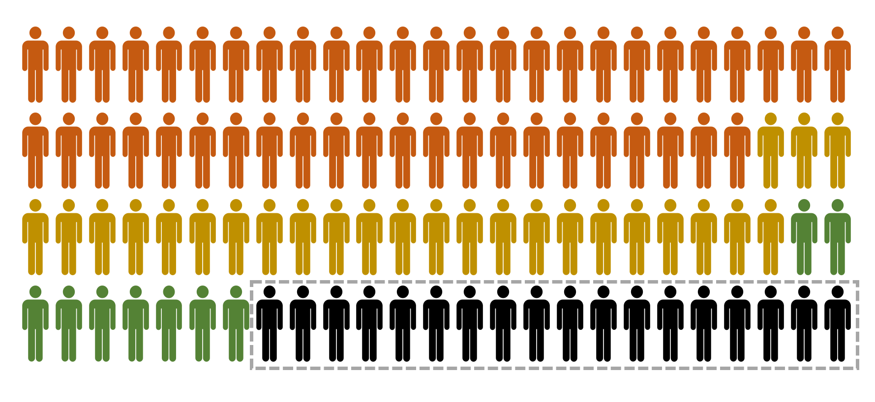
Figure 2. Census pictograph based on grade distribution data from EMU’s first-year writing program.
In 2017, in association with a program the university had contracted with through the Gardner Institute in South Carolina, I served on a university committee charged with curricular revision. We began by asking which courses had high DFWI rates. There were a few approaching 40%—much like the weed-out classes I mentioned earlier. The Gardner Institute, however, would provide data analytics to put a finer point on whom, specifically, was affected based on four demographic indicators—sex, racial-ethnic identification, low-income Pell qualified status, and first-generation status. The outline of Defuie gains meaningful texture—becomes more fully human—with this sort of data analytics. First-year writing, however, was a bystander to the process because although we didn’t then and don’t now have regional or national benchmarks for DFWI rates, the classes in the program I directed at the time appeared to be acceptable, or not as disconcerting as the elevated rates in other classes.
We nevertheless took it upon ourselves to inquire on our own to meet with the institutional data team to ask if we could learn more about Defuie, who Defuie is in these specific terms. We’d imagined carrying out a comparable process to the one already being outsourced by the university. Initial meetings went well. We waited. But eventually we learned that in fact, no, we would not be able to have access to the data after all. Security, data encryption, and control were among the rationale read back to us. For first-year writing at EMU, inquiries into the DFWI population conducted by the faculty charged with directing the program would remain general, vague, only a silhouette, or less. Universities could make information about Defuie far more readily available to program directors responsible for curriculum design, but they don’t. Defuie may be best-known, gradually, by instructors and student support services personnel, but this is insufficient for building and maintaining university programs accountable to the equitable education of everyone enrolled.
Given the institution’s data policy that is willing to outsource the work involved with getting to know the 40 or more Defuies out of 100 students in any given weed-out course, and given the same institutional data policies that disallow a university’s own faculty and academic program directors from inquiring more routinely and systematically into the same questions on behalf of first-year writing programs, what, then, is possible? How can we get to know the 18 students out of 100 who, for myriad and nonobvious reasons, ended a semester in the disadvantageous bottom-right row of the census pictograph? And—in service of writing program administrators doing visual-rhetorical work to gain handles on wicked problems and to lend widespread visibility to such problems—how might census pictographs make a difference?
Heeding the pictograph’s critical suspension between generic forms and the splendor of fully alive, dynamic, vibrant people (importantly best-known by instructors in the classroom), I began to work on the heuristic potential of the placeholder figure to bear visual inflection of the four prominent identifiers focal to the Gardner Institute’s analytics: gendersex, race and ethnicity, income qualification, and first-generation status (Smith, 2018). This is an attempt to animate intersectionally, if abstractly, the table cell where, recalling the cruel spreadsheet we looked at earlier, Defuie adds up.
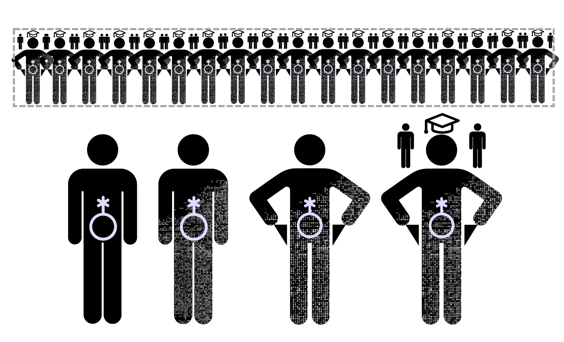
Figure 3. A segment of the DFWI census pictograph here is inflected with graphemic qualities relating to gendersex, race/ethnicity, income level, and first generation status.
The term gendersex refers to complex interanimations among anatomical sex and gender identification. Sex alone remains prone to reductionism and binarism in American culture, and especially in the forms of data collected by colleges and universities about students, though there is important work happening with organizations like Campus Pride to account for LGBTQ identity questions in enrollment data (online). I also consulted the work of Anunna ki Marquez, gender intersex activist, and the gender symbol work they have done, and I selected as an overlay the symbol for genderqueer/nonbinary (Marquez, 2016).
Next, to indicate race and ethnicity as a basis for inquiring into who Defuie is, again in the absence of meaningful and accessible institutional data, I added a background layer designed to initiate the question. Together, then, in combination, the question of gendersex intersects the question of race and ethnicity.
Third, the analysis of the 18% of students who fare disadvantageously in first-year writing considers socioeconomic status, particularly as it relates to low income. For this, the graphical figure shifts shape ever so slightly to imply empty pockets.
And finally, to account for first-generation status, I’ve added plain and relatively small parent-guardian figures along with a cap and tassel over the central figure, the student so disadvantageously positioned in the first-year writing course. Graphical hazards pile up, known but forgiving, if we are willing to regard this as a thought experiment with qualities contingent, varied, some fluid, and some relatively stable over an enrollment span.
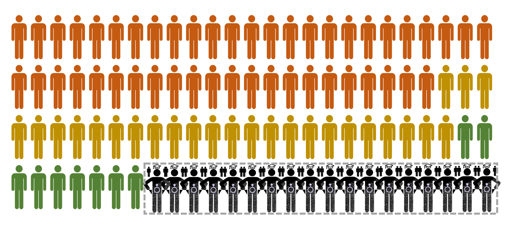
Figure 4. The census pictograph here with DFWI refigured introduces the heuristic potential of graphs to guide more ethical and equitable writing programs. This iteration remains focused only on the segment distinguished as DFWI, though the layering suggests greater amplification when identiary qualities are redistributed across the pictograph.
With the 18% of students in the DFWI range of the census pictograph refigured in this way, Defuie is, with full acknowledgement of limitations in this approach, one thousand caveats, differently animated. Defuie is no longer cornered statistically in a spreadsheet; vital indicators of Defuie’s full, honorable existence are no longer muted, obfuscated, or downplayed. The silhouette of Defuie elicits an intersectional potential for us—as responsible program administrators and teachers of writing—to engage.
But for whom does this translation of tabular, numerical data into census pictographs really make a difference? There are cases to be made that work like this matters for a wide variety of stakeholders: For current and prospective students, this means entering a program in which there is an ethic of equitable regard for intersectional lifeworlds whose complexities far exceed the identificatory categories routinely collected in admissions processes; for established, experienced writing program administrators, this offers a generative model with which to think together about DFWI rates and those who are affected most by them; for new (whether early career or newly arriving) writing program administrators, this visual model makes available a series of questions not as of yet routinely circulating in the field, in the scholarship of the field, on writing program websites, or among the students whose campuses we serve on. Finally, there is the potential for this infographic to catalyze institutional change, especially among administrators of all ranks, and especially among instructional staff. By noticing foremost that Defuie is knowable, and confronting the certainty that institutional data—whether it is felicitous or infelicitous, available or unavailable—cannot tell us what we need to know about such patterns, instructional staff can do better to support every student who enters the classroom.
Cruel pies are cruel for excising humans from view, for eliminating or obscuring human-data interplay, and for muting the consequences of patterns for real people. For Dragga and Voss, that cruelty manifested around casualties and hazards. Arguably, in this context, Defuie pinpoints, acutely and with concern for scale, the failure of the academy to live up to its promise for everyone it admits. Everyone. The broad field of Rhetoric and Composition/Writing Studies, first-year writing programs, writing program administrators, instructors, and many more have historically led efforts to make academic programming hospitable for all.
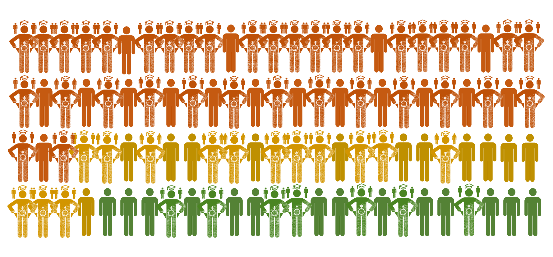
Figure 5. The census pictograph here with DFWI refigured and also with hue adjusted instigates the potential of justice ontographs to world-make—in this instance, a world in which DFWI, for being intersectionally reanimated, achieves success at university.
Yet the graphics, no matter how positively framed and reframed, don’t instantly fix or wave a wand on the world’s rampant, systemic cruelties. Work remains, and part of the work that follows the development of census pictographs like these is to confront cruel optimism: to build and to circulate these data sets for our programs, to model this approach to general education reform for writing programs and also for others on our campuses, especially those involved with so-called weed-out courses, wherever they lurk. Curricular adaptations that heed the possible Defuies showcased here can lead toward more ethical and equitable writing programs, sure, but also toward more ethical and equitable general education programs, departments, and, in turn, colleges and universities. Writing program administrators, whose work intentionally merges visual rhetorics with administration, are best poised to forge this work, openly, relationally and intersectionally, with deep respect for allyship, its boundaries, and its increments of change, both felt and substantial.
The census pictographs featured here function as what I am increasingly drawn to describe as justice ontographs—relational mini-worlds, infographics, exploded views of academic articles (or worknets), and more. I believe these offer great potential to animate the underexamined corners of spreadsheets and the populations rendered minimally visible therein—as well as myriad other social justice issues on campuses and off and everywhere all around.
Notes
1. Incompletes (Is) appear as zeros in the table due to the systems for communicating incompletes at Virginia Tech. Because this is a historical snapshot, all Is were converted to a new letter grade on the A–F scale.↩