Path 6. Visualizing Advocacy
 WPAs create and employ graphics to advocate on behalf of students in our programs and elsewhere on campus. Chapters in this path illustrate the ability of graphics to work toward more equitable academic practices for undergraduate and graduate student populations.
- 02. "Silhouette of DFWI: Census Pictographs as Social Justice Heuristic," by Derek Mueller
- 07. "Is Teaching Just a List? Toward Feminist-Humanistic Visual Representations of Being a Writing Teacher," by Rachel Gramer
- 10. "Visualizing Fairness: A Critique and Revision of Placement Practices for International ESL Students," by Jamie White-Farnham
Mapping Writing Program Administration
A Response to the “Visualizing Advocacy” Path
“To ask for a map is to say, ‘Tell me a story.’”
“The first lie of the map is that it is the truth.”
Peter Turchi (2004), Maps of the Imagination: The Writer as Cartographer, p. 11 and 73
A scene: I’m preparing for class this semester, a special topics class on the rhetoric of maps. I reread Peter Turchi’s (2004) chapter where he notes that maps help us see in new ways, reduce our fear of the unknown, and suggest explanations (p. 11). I revise my Google slides, add an image of the Mercator map, hone a few discussion questions. In another tab, my unread email list blinks at me. When I turn to it, there’s an invitation from this collection’s editors: Would you be willing, they write, to respond to chapters about visualizing advocacy, to a cluster of scholarship about how data visualizations might “illustrate the ability of graphics to work toward more equitable academic practices for undergraduate and graduate student populations?” (editors’ letter). I, of course, immediately say yes. I had thought of this special topics class as a kind of secret guilty pleasure, a bit of indulgence, a wonderful distraction from my (also wonderful) program administration world of data, reports, policies. Instead, I’m finding connections all over the place and am looking anew at my own whiteboard diagrams and report pie charts. Amy Propen’s (2012) rhetorical analysis of a NASA photo challenges my students and requires me to rethink how, why, and when I use visuals. Miles Kimball’s (2006) interrogation of John Snow’s groundbreaking “poverty maps” raises questions about the humanity behind the numbers and colors in class, and this analysis provokes me to reconsider our representations of students in our first-year writing program’s reports. The opportunity to see how other writing program administrators (WPAs) are reconsidering how visuals might help us see in new ways or suggest alternative explanations is, then, alluring.
A confession: I have no particular background in visual rhetoric. Seizing the rare opportunity I had to teach our undergraduates in our Writing, Rhetoric, and Technical Communication major, I chose this course topic for largely selfish reasons. Like Nedra Reynolds, I have a “practical fondness for maps, an admiration for their logic and confidence in their usefulness” (2004, p. 4). And despite being an unabashed word person (a very wordy word person, someone once said), I too, like Jamie White-Farnham (in her chapter in this collection), am someone “for whom a graphic depiction of a concept or process speaks volumes.” Cartography is technical communication and it is beautiful: It draws me in even as I am only now developing the language to describe and understand it. For someone with no scholarly expertise in visual rhetoric, teaching a class on the rhetoric of maps is an act of both hubris and humility. But then again: so is administering a writing program. I proposed the course because maps intrigue me, because I use the word somewhat easily (and likely far too loosely) when I describe a process or any kind of articulation work that I do as a WPA, because it is a metaphor and a practice that is illuminating for me.
Throughout this rhetoric of maps class, we have crystallized the questions we ask, returning to: What story is this map telling? We are learning, over the course of the semester, to ask about the stories not told, the silences around the edges of the map, the omissions and inclusions and the importance of distortion, color, size, scale. Maps challenge us again and again because they appear neutral or objective on first and even second glance. It is upon deeper digging that we see inequities, distortions, fuzzy margins, propaganda, perspective. My colleague Les Hutchinson offers Eichberger’s “Maps, Silencing, and Standing Rock” (2019) to us, and this scholarship speaks to these writing students: one map isn’t enough. A place (and/or concept, people, idea) deserves multiple maps, some alternative like what Barton and Barton call for: collage, perhaps, or palimpsest, a way to acknowledge multiple lived experiences in one space (1993, p. 76). Over-relying on one map distorts the story.
These three chapters explore how writing program administrators (WPAs) can use various kinds of visualizations to better do our work. They each call for ways that a visual might offer another perspective, might speak back to a common sense story, might help us better understand students, learning, advocacy. They also illustrate how visual work is processing work and how it is performative work. My response here is composed with Turchi’s claim in mind—that “exploration” is “assertive action in the face of uncertain assumptions” (2004, p. 12) and so here I seek to explore, however modestly and briefly, the productive disruptions/alternative maps that these pieces offer.
Each chapter illuminates a different point within the landscape of learning and teaching first-year writing:
- international first-year writing students and placement policies (White-Farnham);
- all first-year writing students and DFWI rates at two institutions (Mueller); and
- first-year writing instructors more generally, new first-year writing instructors at one institution, and conceptual understandings of teaching writing (Gramer).
These analyses center on three different visuals that shift:
- a flowchart revised (White-Farnham);
- a chart-turned-pictogram-turned-enriched-pictogram (Mueller); and
- a list reconceived of as an infographic (Gramer).
In each of these cases, the visual being analyzed is additive and shifting. Their temporality affords them utility and grace as each seeks to humanize students, teaching, and learning.
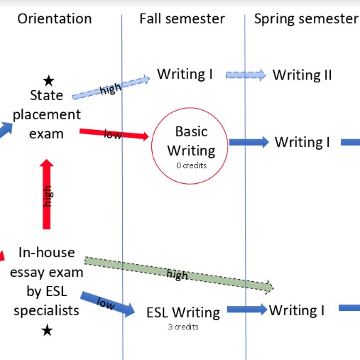
Jamie White-Farnham’s chapter “Visualizing Fairness” describes how a WPA’s need to better understand a process led to her drawing a flowchart to better understand how international student placement worked on her campus. The flowchart illuminates sticking points in a process, becoming another window to explore “the relationship between the spatial and the social” and to make evident a process, which sent a subgroup of international students into a secondary placement loop, that didn’t serve them especially well (Reynolds p. 86). White-Farnham analyzes this flowchart as a tool that helped reveal gaps and inconsistencies in placement processes, ultimately leading to changes in that process.
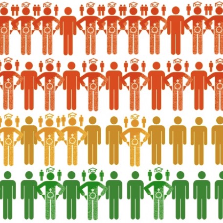
Derek Mueller’s “Silhouette of DFWI” interrogates drop, failure, withdrawal, and incomplete rates at two different institutions, seeking to “reanimate” the genericized student figure representations often used in success rate student data. This work is aspirational, seeking to interrupt and enrich a flattened representation of students by acknowledging sex, race and ethnicity, socioeconomic status, and first-generation status.
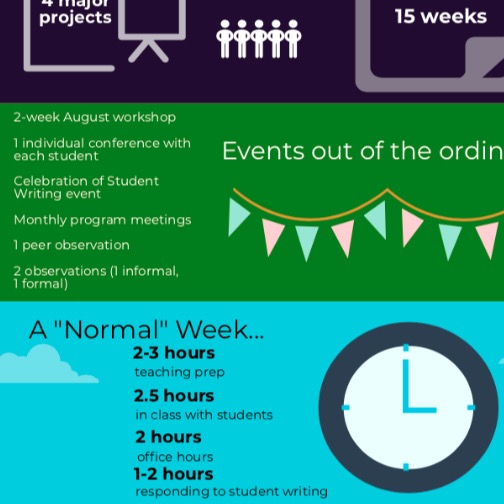
Rachel Gramer’s chapter, “Is Teaching Just a List?,” turns a fresh eye toward one of the relatively few visual representations within our field, Richard Haswell’s chart, “Average Time-on-Course of a Writing Teacher.” She explores, rightly, what this particular representation of the work of teaching writing emphasizes and what it elides. Her chapter illuminates how visuals define and also how they circulate. Haswell’s chart has persuasive power for helping WPAs across the country articulate workload constraints; at the same time, the chart defines labor by time. Gramer’s revised infographic, written for incoming graduate instructors, redefines what it means to teach writing through visualizing space, patterns of workflow, and time.
Collectively, these chapters speak to three aspects of rhetorical cartography that I find especially compelling:
- embracing visual as process;
- reconsidering how we might move toward purposeful integration of textual and visual elements in our own scholarship; and
- acknowledging that visuals necessarily include and exclude.
To the first point: Clearly these scholars see, and effectively employ, visual elements as thinking processes. For each of these writers/administrators, the act of drawing, mapping, or reconceiving of a visual facilitated a revised way of thinking about students, learning, and/or teaching. There are practical strategies that many of us likely make use of all the time: drawing diagrams on a whiteboard, making a chart of program learning outcomes, and so on. Enlivening everyday practice with drawings, diagrams, and charts can help deepen our own personal learning.
Secondly, most faculty administrators already live at the intersections of teaching, scholarship, and leadership/service. We digest a pass rate chart in the morning and then teach a writing class in the afternoon. We experience these traditional boundaries as fluid ones, and purposefully integrating more visuals—as teaching practice, as administrative vision, as research articulation—can usefully enhance the textual/visual elements of our lives. In addition to a more traditional sense of mapping as a historical practice, mapping is also “a cultural practice that may impact “how the space is perceived and what action takes place within it” (McDowell & Sharp 25 in Propen 7). Integrating more visuals—continuing to be word people, but also more fully drawing on the affordances of visuals—might facilitate reconsiderations of space, actions, people, and consequences.
Third: No visual is neutral, every visual excludes and includes, and every visual is necessarily one among many. These chapters thus challenge us to consider how WPA practice might invite multiple maps—conceptually, literally—of curricula, programs, and policies. What might it mean to render student data in a chart, a pictogram, a picture of students in class, a class roster, and hand-drawn or Google My Maps versions of how students interact with and navigate campus? What if we used different pictures of the same data to help us better understand sticky problems?
The allure and the danger of a map is baked into any visual: It appears neutral, objective, merely a statement of fact. That is the damage that a visual can do: If we look at a pictogram of students and call it, say, “fall 2019 first-year writing students”—rather than identifying it as “a representation of fall 2019 first-year writing students” we confuse the representation with reality (see Barton & Barton, 1993). But interrogating visuals with currency in our field or institutions, employing more visuals, encouraging additional visuals of the same data—all of these practices can help remind us not to slip, to remember that each representation is just one more picture. As Amy Propen reminds us, “map making is about power, about shaping the dialogue”; it can also “[invite] participation and dialogue” (2012, p. 7). Recognizing the inherent power in any visual representation can help us, in turn, use that power to include participation, to look for silences and omissions, and to provide alternative perspectives. These three chapters enliven the everyday work of writing program administration through using visuals to tell another truth and to bring more texture to representations of lived experiences.
References
Path 6. Visualizing Program Advocacy
02. Silhouette of DFWI
07. Is Teaching Just a List?
Rachel Gramer